SafeHer redesigns the most vulnerable part of a woman's commute: the wait.
A physical-and-digital service concept designed to make waiting safer, more visible and more predictable for women commuting through Karachi.
SafeStops provide the protected waiting environment, while the app helps women find stops, plan routes, follow arrivals, check in and access support.
Research, problem framing, service concept, user journey, app experience, visual system and testing.
Physical-space modelling and final 3D visualisation, with a 3D designer — guided by a thesis advisor.
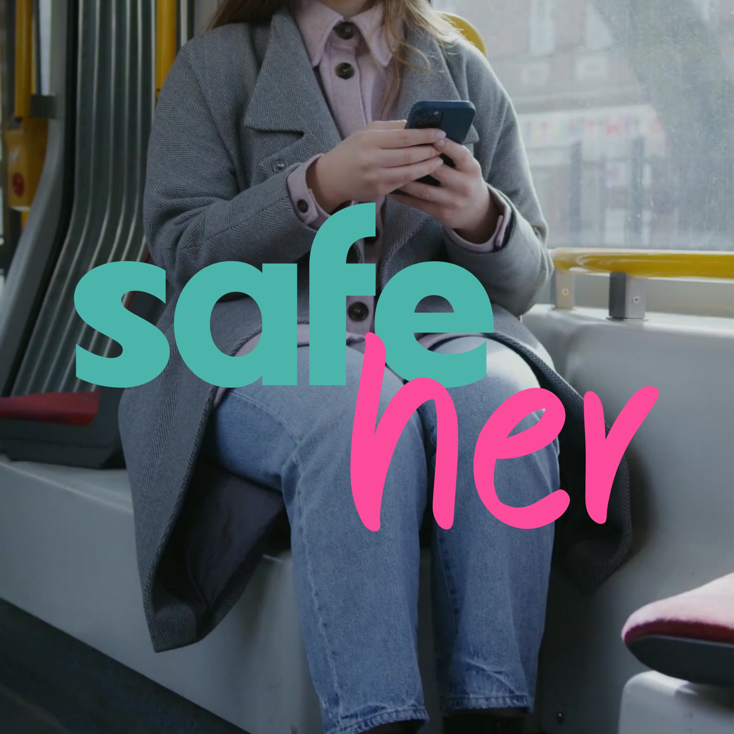
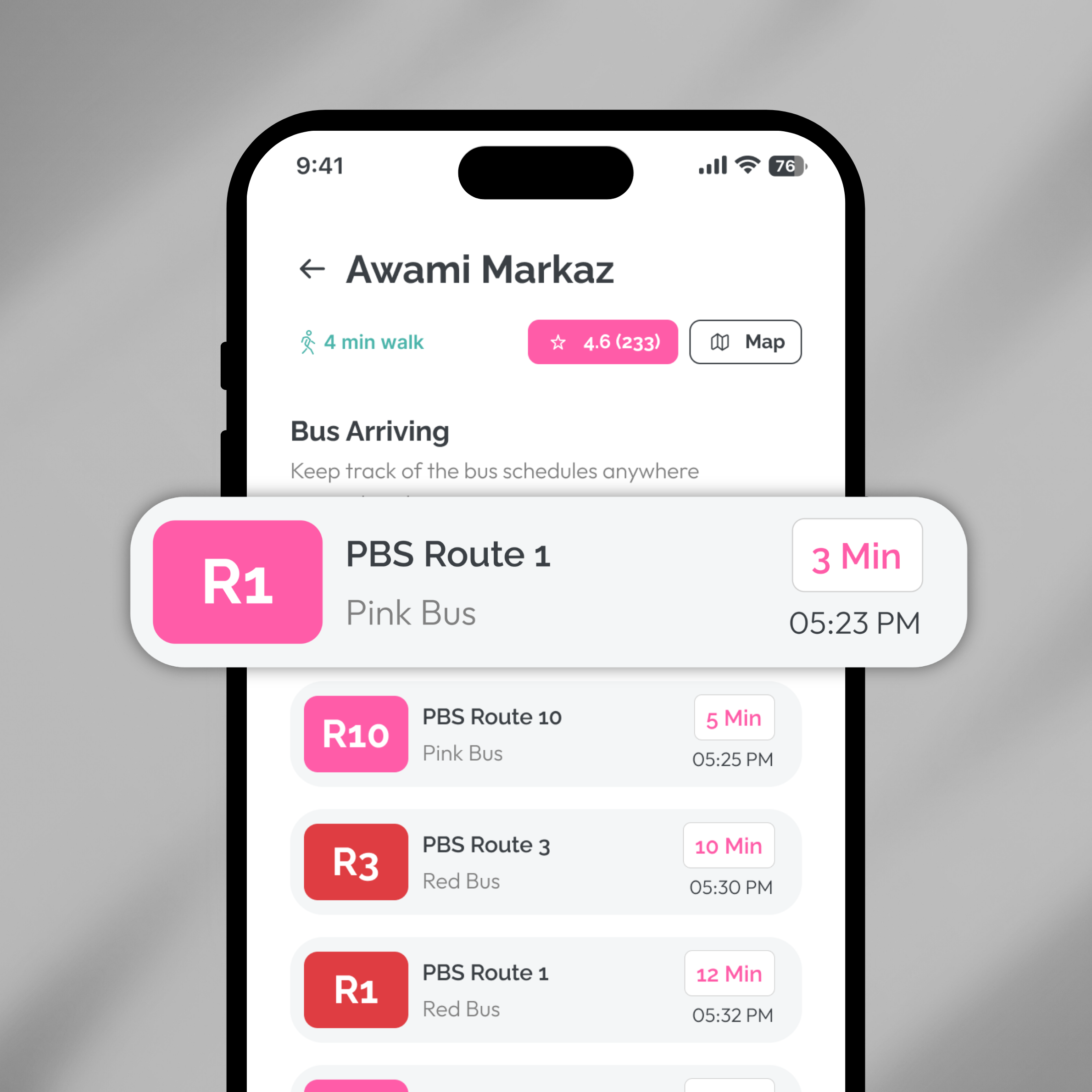
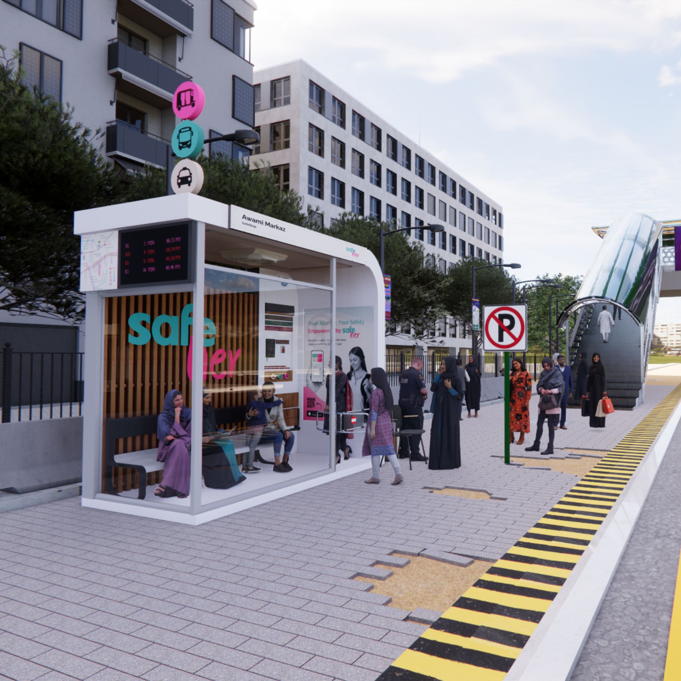
Women commuting through Karachi often spend long, uncertain periods waiting in exposed, poorly managed and male-dominated public spaces.
SafeHer combines visible, monitored waiting spaces with a digital service for finding stops, planning routes, checking arrivals and accessing support.
The most vulnerable part of the journey was not always the vehicle. It was the wait before it arrived.
Concept-tested with women commuters and presented publicly at the IVS Degree Show. The measured response appears in the outcome section later in the case study.
One connected journey, from finding a SafeStop to boarding the ride.
SafeHer connects route planning, a visible waiting environment, live transport information and access to support so women spend less of the journey waiting without information or control.
-
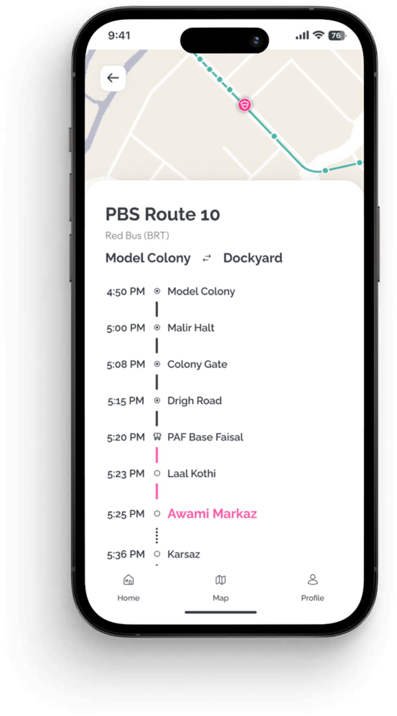
Plan the route and find a nearby SafeStop.
The commuter plans the route and identifies a nearby SafeStop before reaching the road.
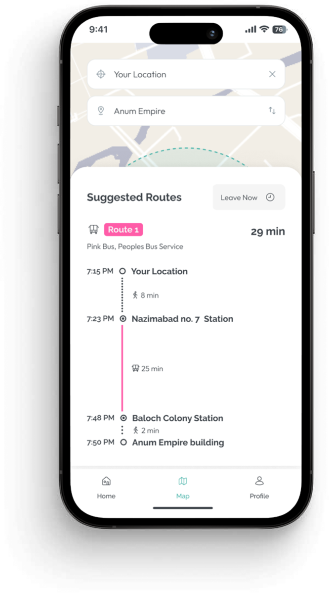 Plan & find · prototype
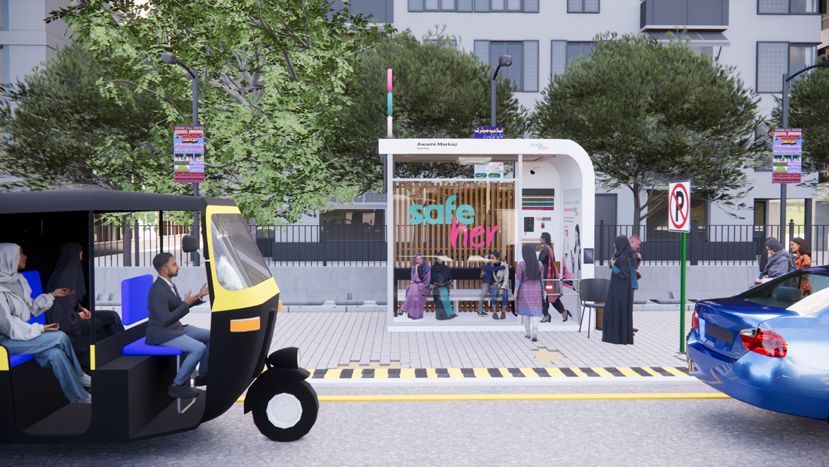 Proposed SafeStop location
-
Check in and wait in a visible environment.
The commuter reaches the SafeStop, checks in through the service and uses a visible waiting environment with seating, lighting and the journey still in view.
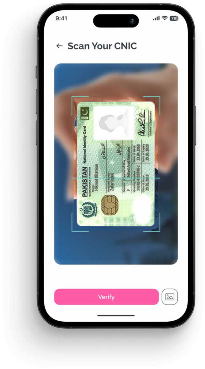 Verified access · prototype
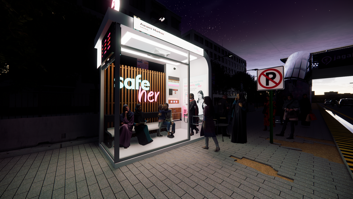 Contextual concept render
-
Follow arrivals, and signal the expected ride.
The service provides live arrival information and supports signalling the expected bus, rickshaw or ride, so the wait stays informed.
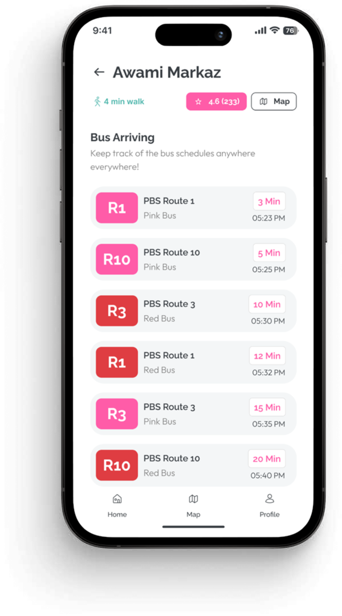 Live arrivals · prototype
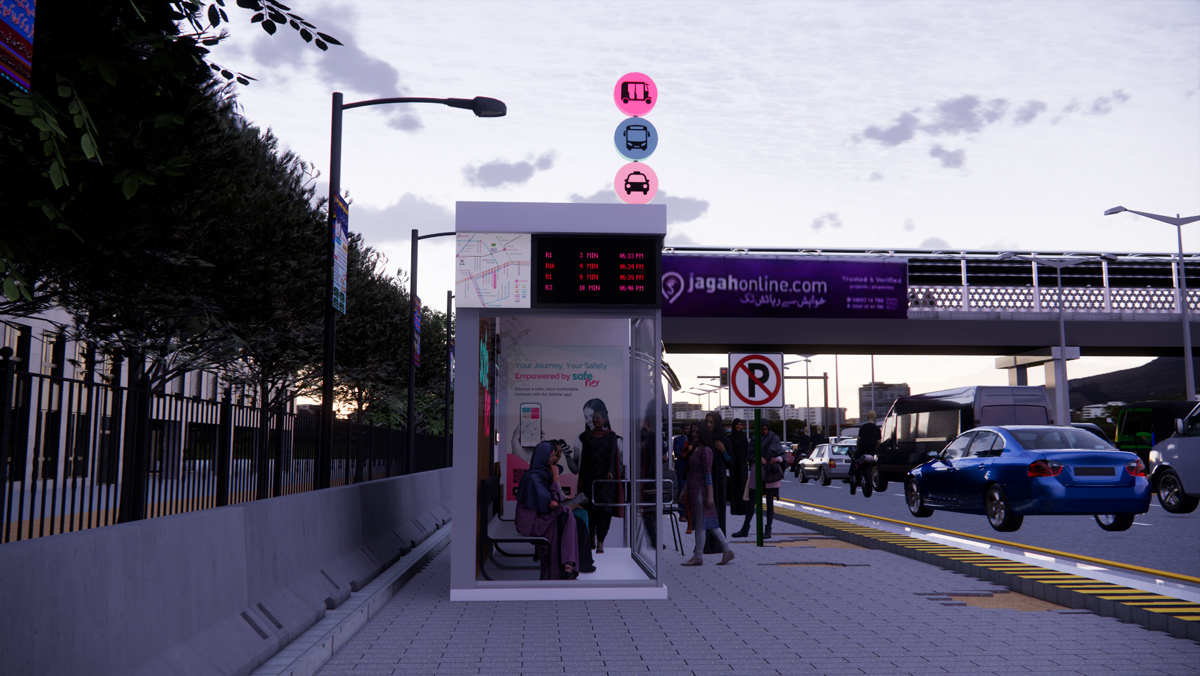 Proposed signalling interaction
-
Continue the journey with support connected.
The commuter continues the route with location sharing or support available, without restarting the journey in another system.
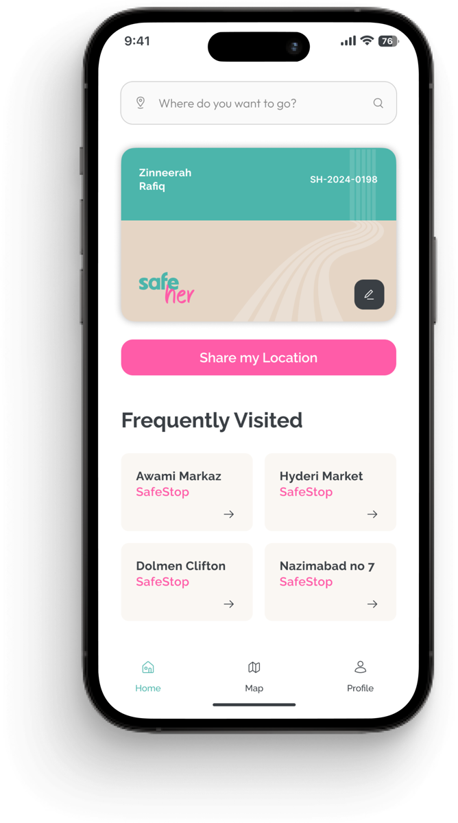 Prototype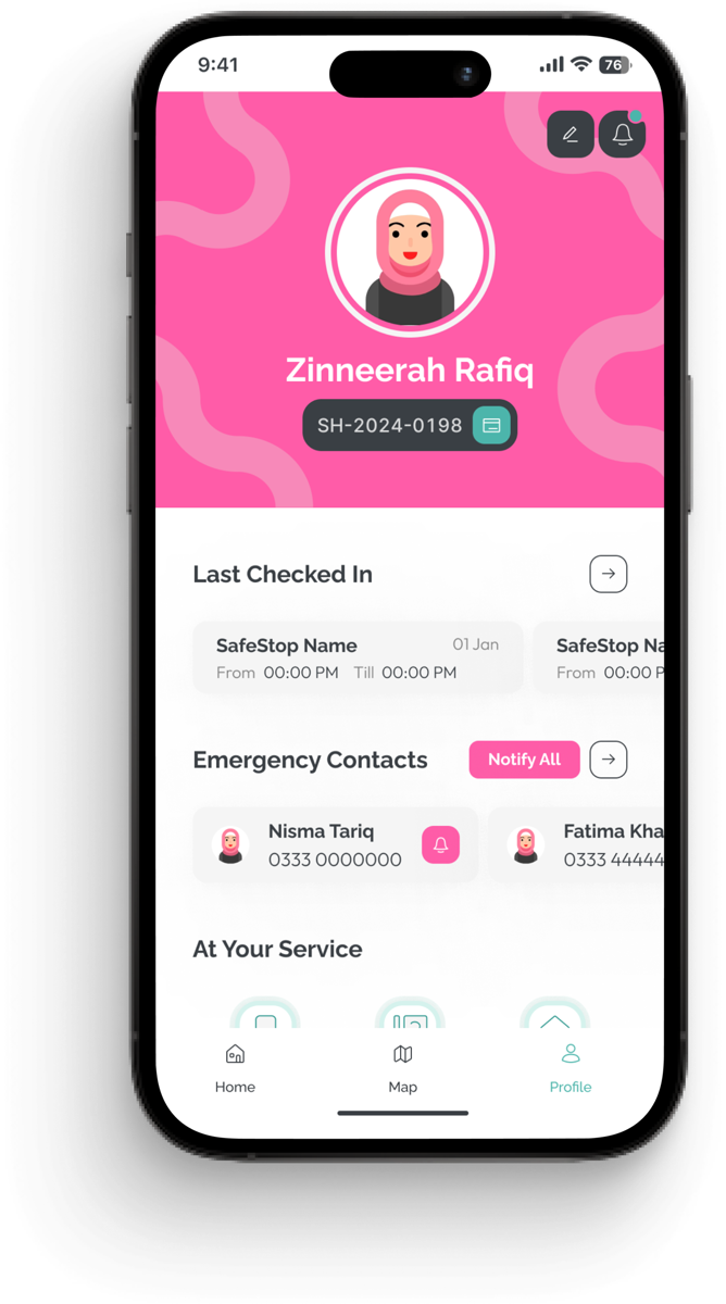
The problem was personal.
Years of commuting through Karachi made the waiting stage familiar: long gaps between rides, uncertainty about where to stand and the constant calculation of how visible or exposed a place felt.
- Prepare
- Leave home
- Reach the point
- Intervention point Wait
- Board
- Travel
- Arrive
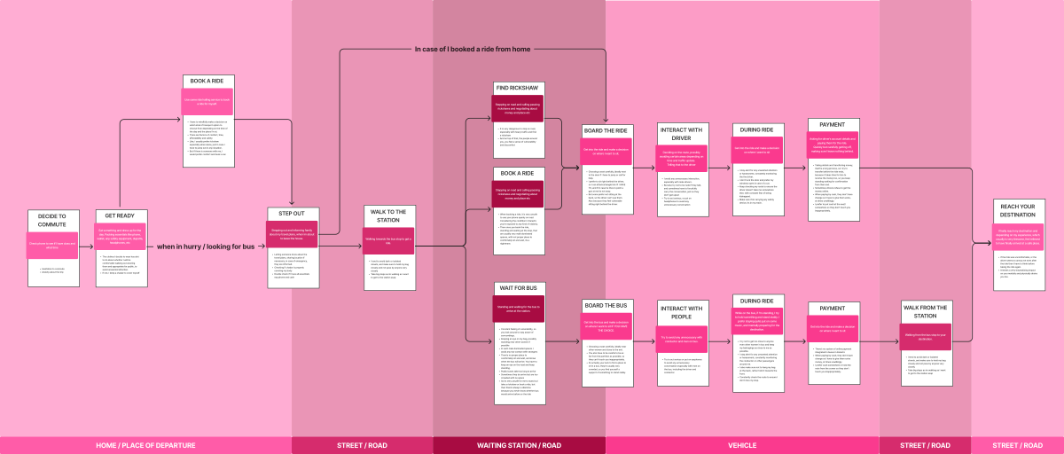
The most vulnerable part of the journey was often the time spent waiting.
Women were not only navigating unreliable transport. They were spending long, uncertain periods in exposed public spaces with limited information, limited seating and little control over when or how the journey would continue.
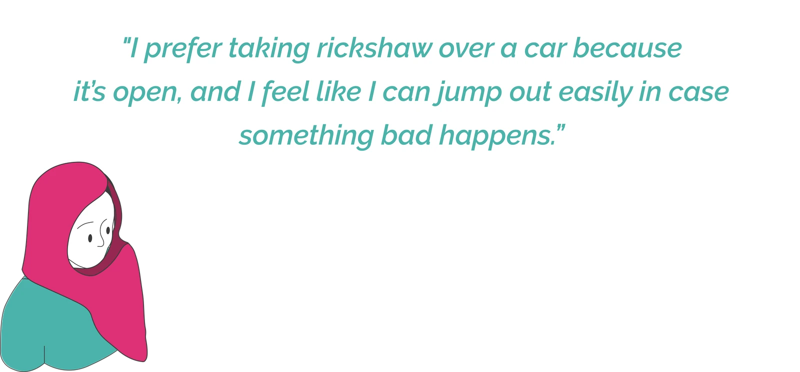
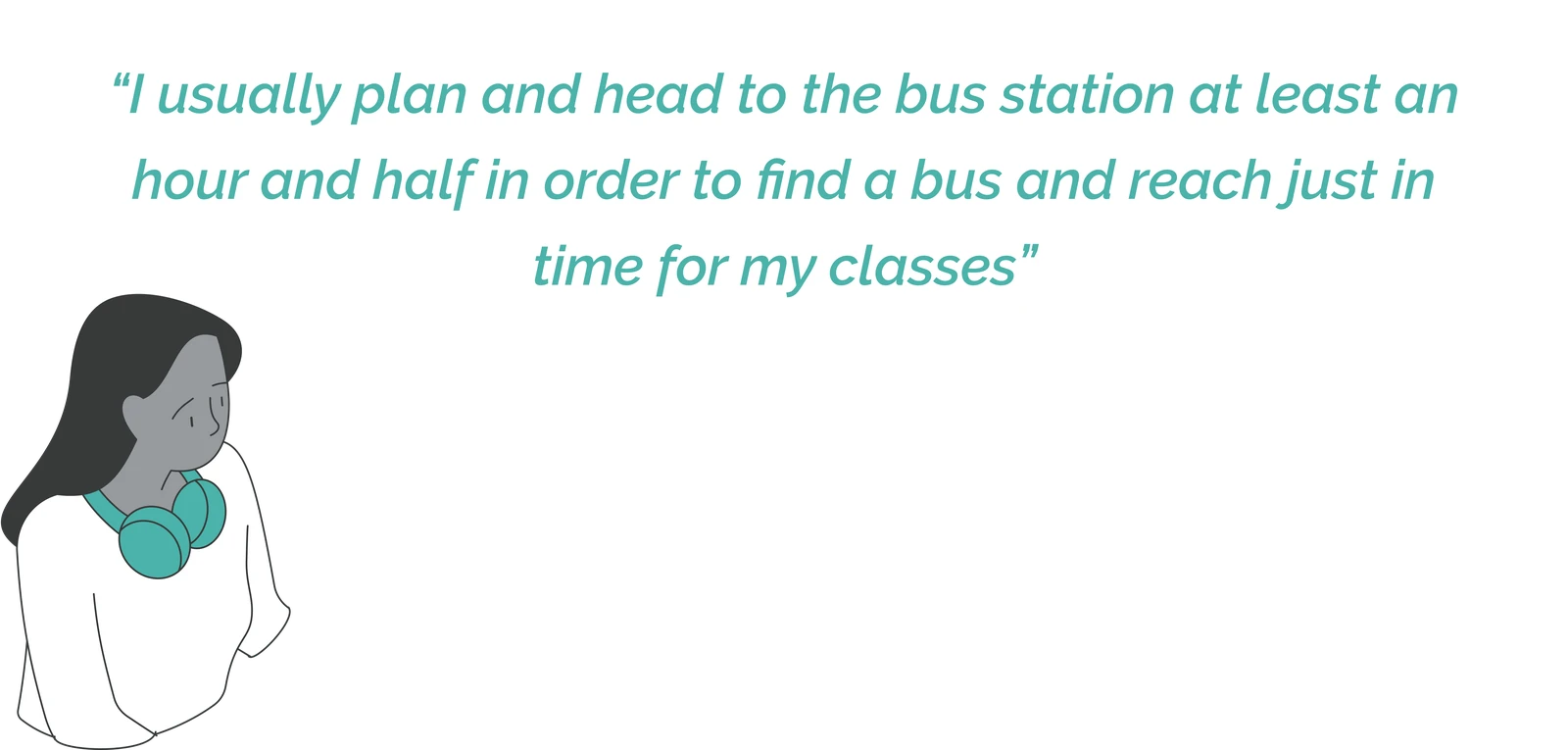
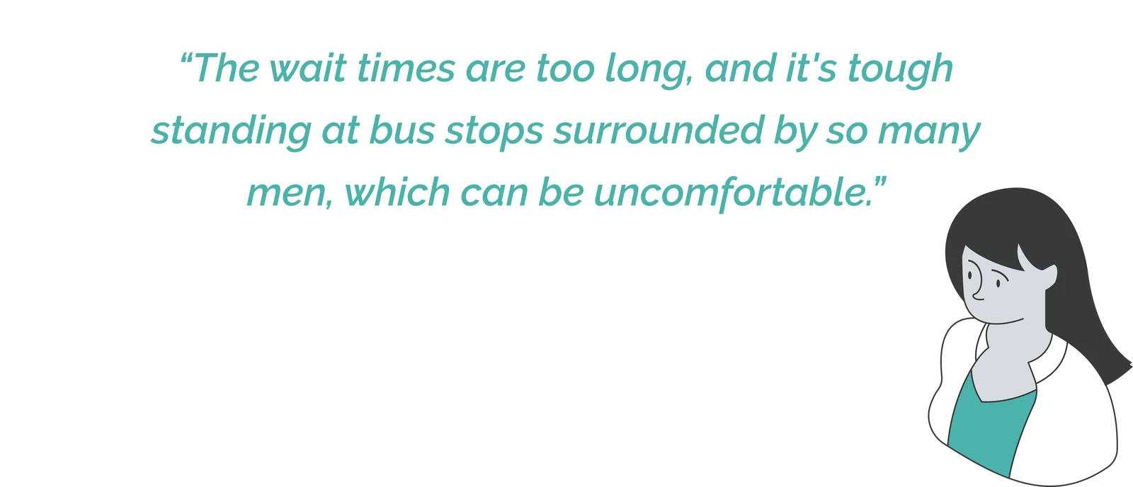
Four conditions made the wait especially difficult.
The journey and participant accounts revealed spatial, emotional and informational pressures concentrated around the waiting stage.
Male-dominated public spaces
Women often wait beside roads or in spaces where they feel highly visible and outnumbered.

Constant sense of vulnerability
The environment requires continuous awareness of people, exits and possible changes in the situation.

Long, unsafe waiting times
Unreliable arrivals can extend the time spent exposed without a clear alternative.

Poorly lit, abandoned bus stops
Many waiting points provide little lighting, seating, information or active oversight.
The first ideas tried to improve the whole commute.
Early concepts explored information, navigation, payments, transport access and improved waiting infrastructure.
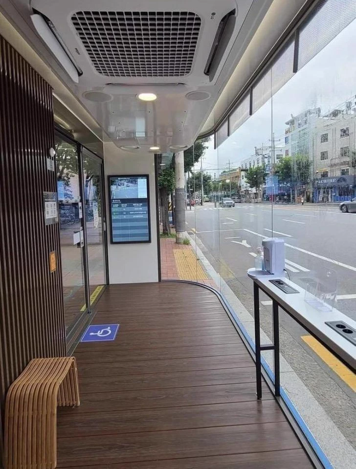
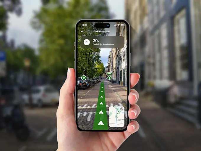
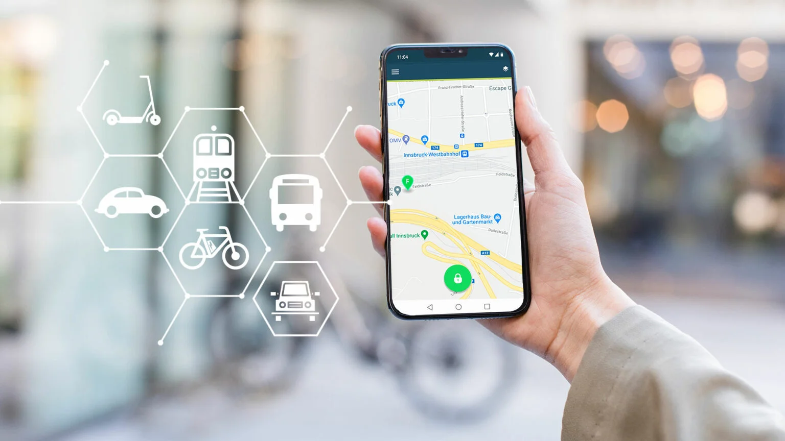
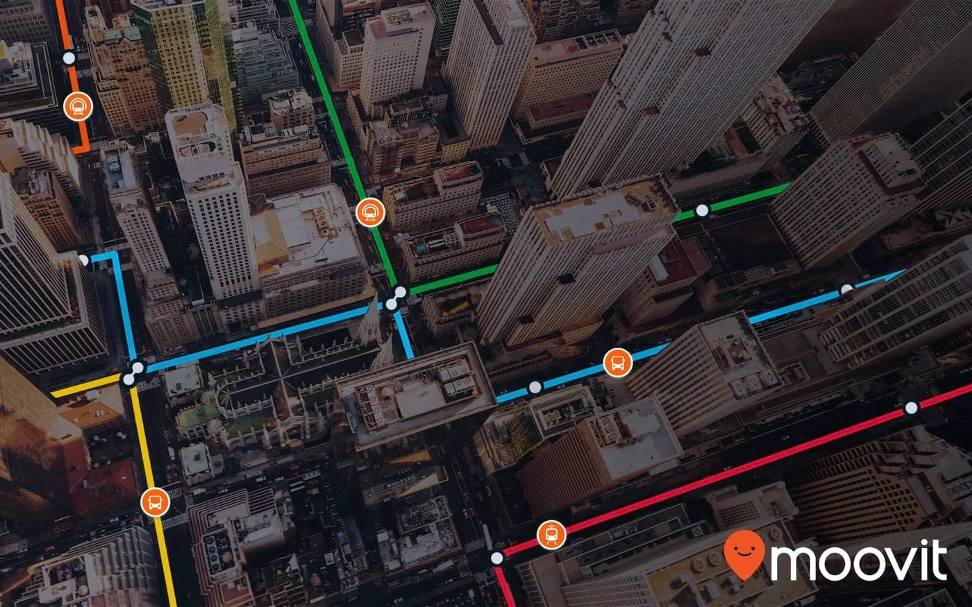
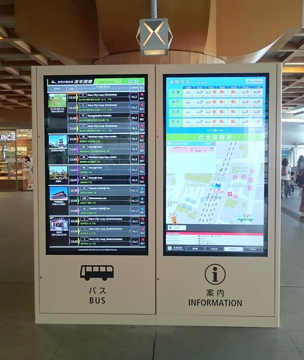
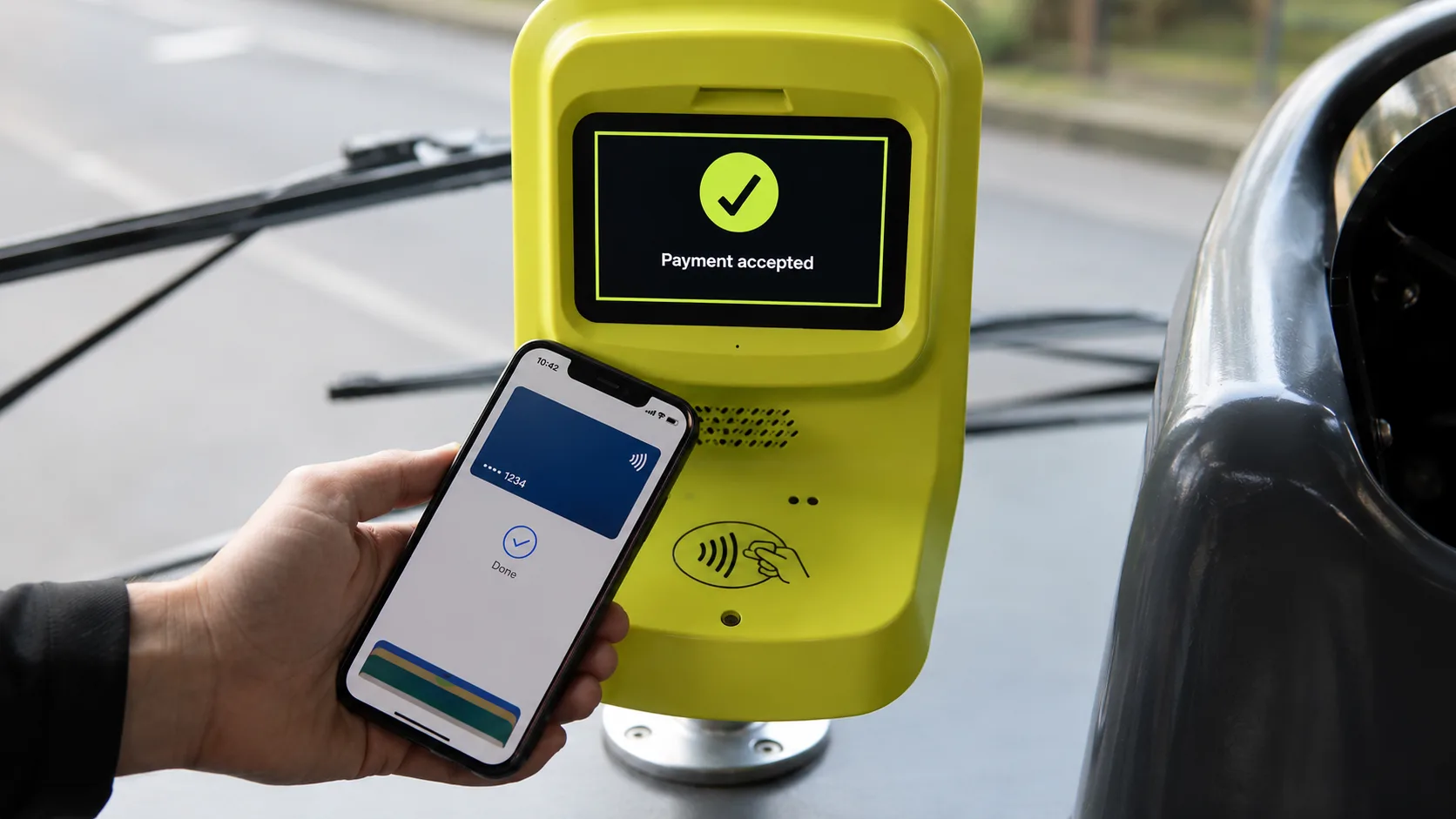
The concepts assumed that a usable stop already existed.
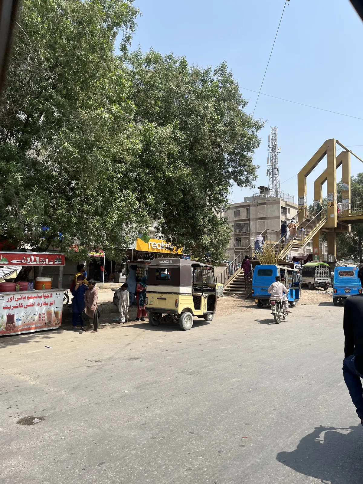
Field visits across Karachi revealed that many waiting points were informal, poorly defined or missing the infrastructure the initial concepts depended on.
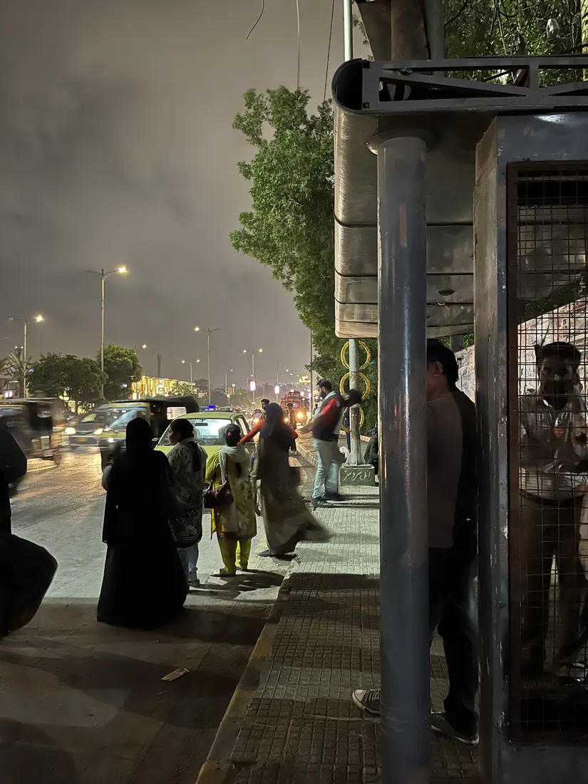
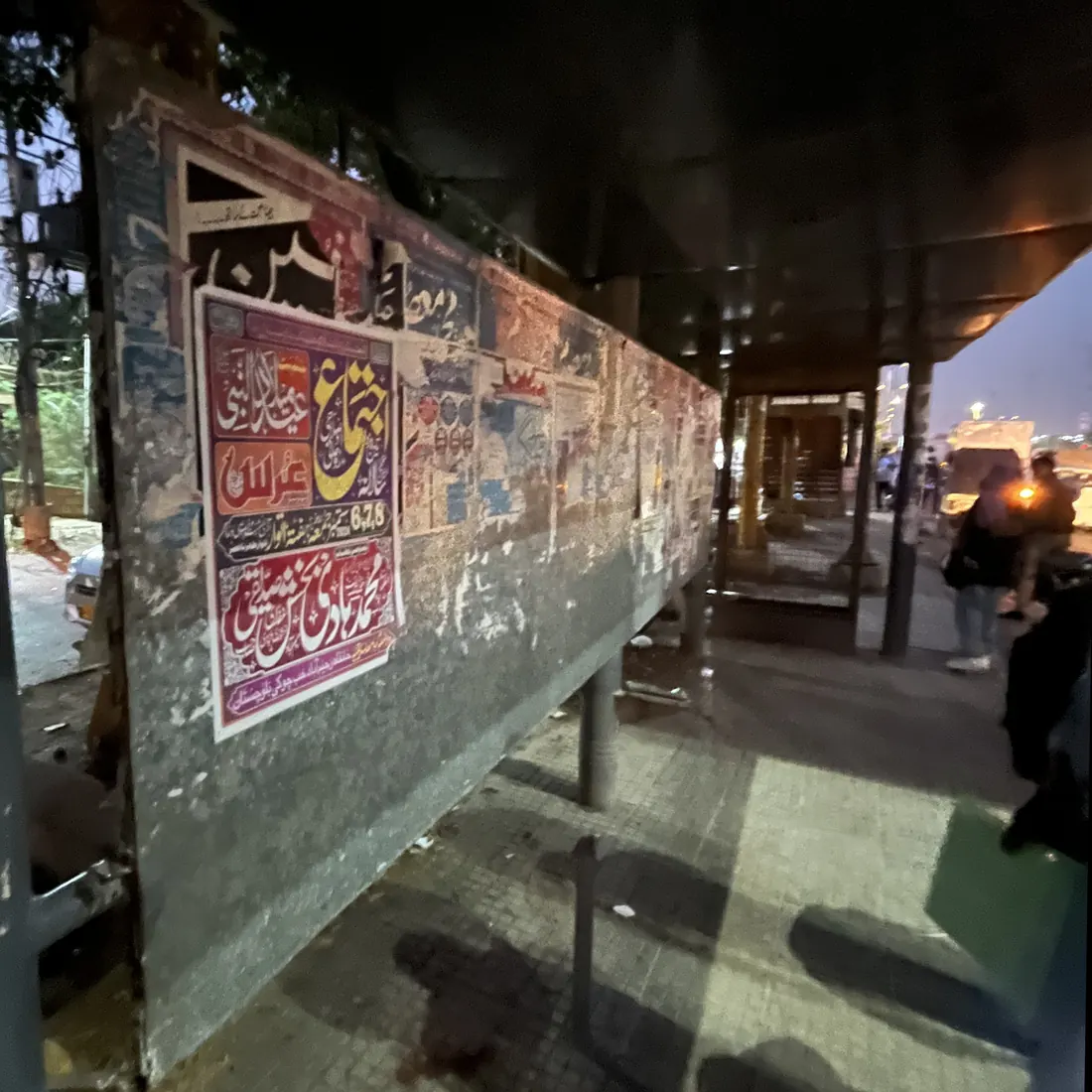
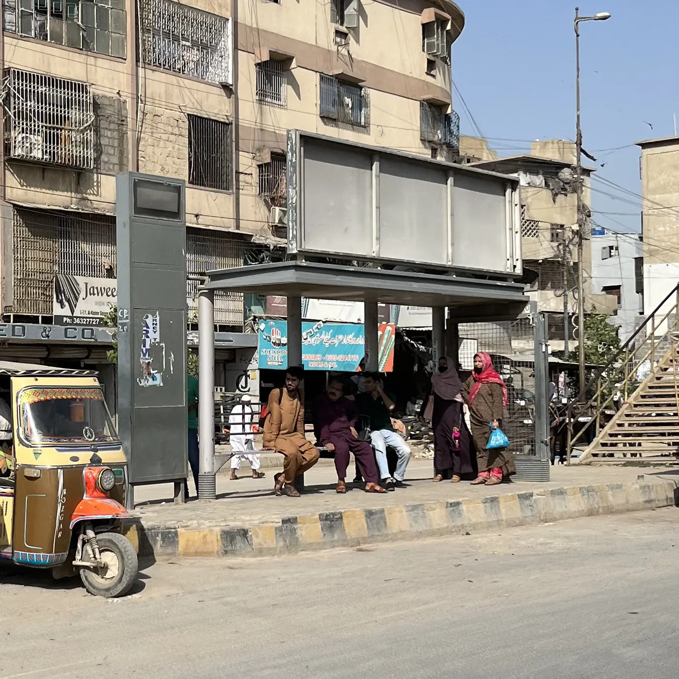
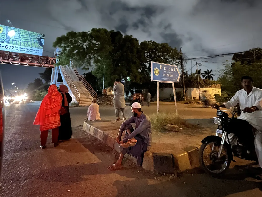
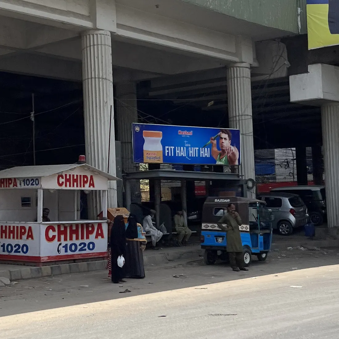
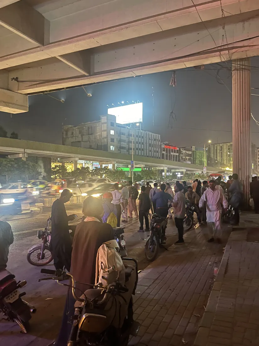
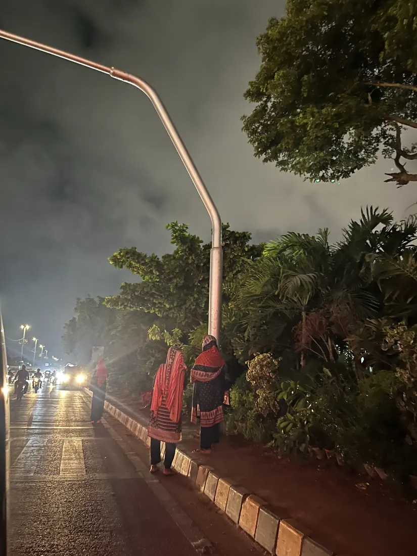
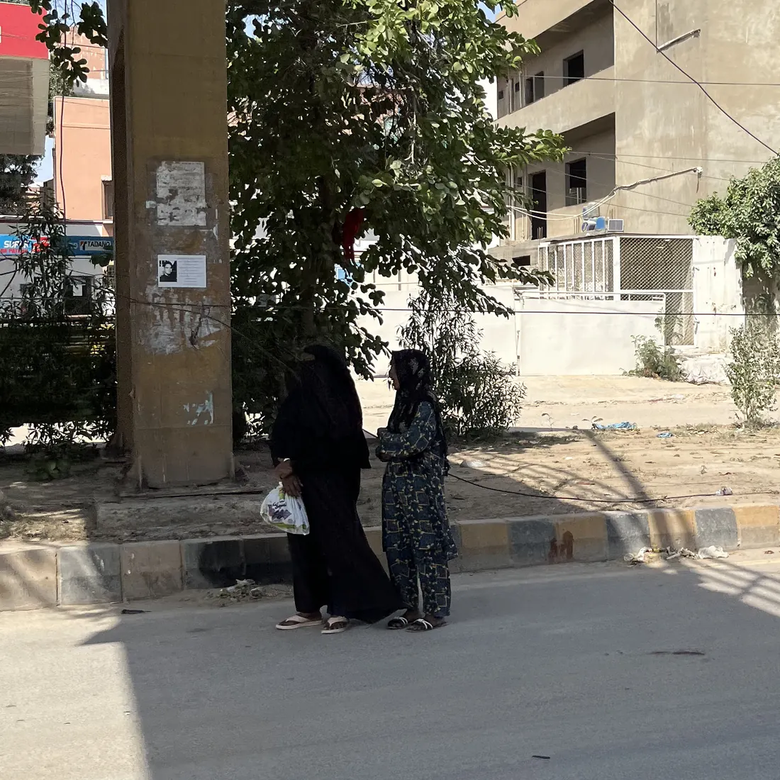
Field documentation · Karachi · 2024
In many places, the stop was only an understood point on the road.
- A recognisable stop
- A defined boarding point
- Visible route information
- Space for a kiosk or digital display
- Accessible waiting infrastructure
- Informal roadside pickup
- Unclear stopping points
- Limited or absent information
- Poorly positioned infrastructure
- Little seating, shelter or accessibility
AR directions, transport aggregation, payment and digital kiosks could improve parts of the journey—but they depended on a physical waiting environment that often was not there.
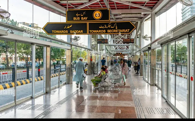
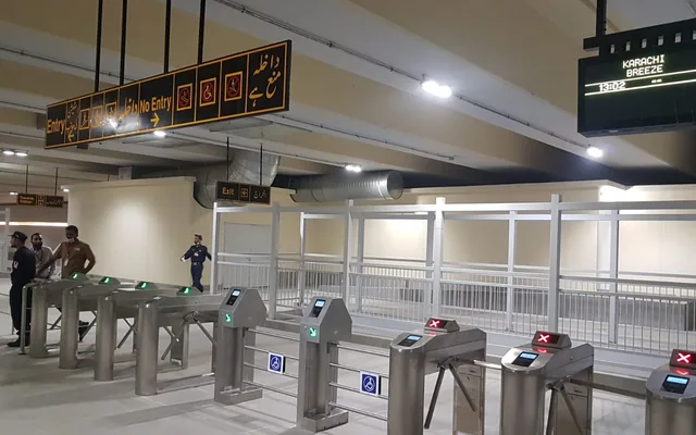
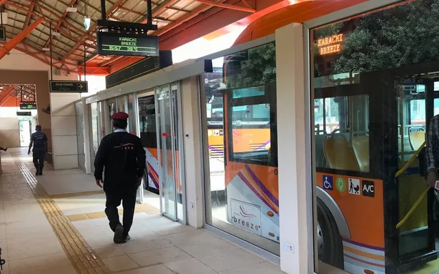
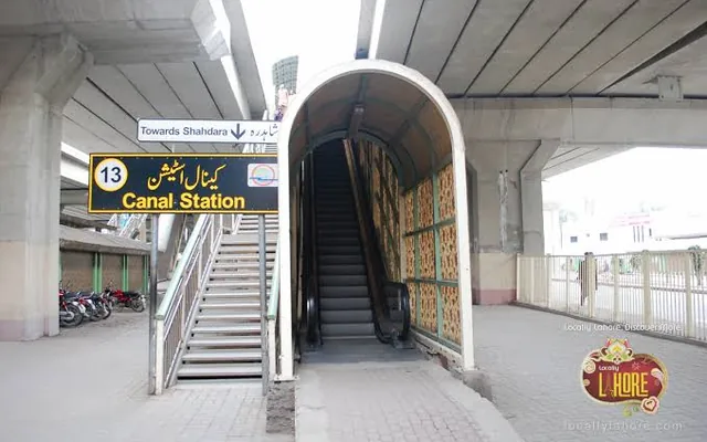
Structured systems in Pakistan showed which conditions were possible locally.
If informal waiting points showed what was missing, higher-structure transit systems demonstrated the value of defined stations, visible information, accessibility and clearer boarding behaviour.
-
Islamabad–Rawalpindi Metrobus
-
Karachi Green Line
-
Karachi Orange Line
-
Lahore Metrobus
-
Lahore Orange Line
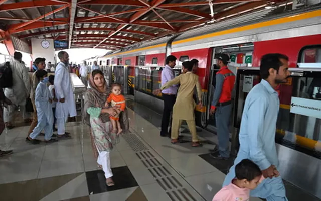
-
Peshawar BRT
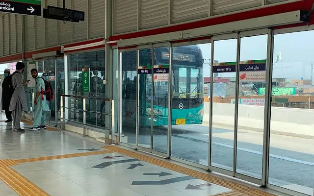
| Service condition | Structured transit systems | Informal waiting points | SafeHer opportunity |
|---|---|---|---|
| Defined station | Usually present | Often unclear | Create a recognisable waiting point |
| Route information | More visible | Limited or absent | Bring information into the waiting environment |
| Accessibility | More consistently designed | Often missing | Build access into the physical service |
| Visibility | Managed environment | Variable | Design transparent and well-lit waiting |
| Boarding clarity | Clearer stopping point | Often requires stepping into traffic | Add signalling and defined pickup behaviour |
A targeted comparison of service patterns, not a ranking of cities. The strengths varied between systems; the comparison suggested which conditions a redesigned waiting environment would need to provide.
The concepts were useful — but many solved the wrong layer.
- Maps
- Schedules
- Ride aggregation
- Route recommendations
- Emergency buttons
- Wi-Fi
- Digital kiosks
- A visible place to wait
- A defined transport pickup point
- Reliable information at that place
- Seating and accessibility
- Controlled access and support
- A connection between the physical stop and the digital journey
A better app could inform the commuter, but it could not change the environment where she was still required to wait.
Sacrificial concepts helped separate essential needs from attractive features.
Instead of asking participants to invent the service from scratch, early concepts made different priorities tangible enough to challenge, reject or combine.
Reduced exposure while waiting.
A separate seat alone did not resolve visibility, access, information or environmental conditions.
Expanded into a complete waiting environment rather than remaining an isolated seating feature.
Reduce uncertainty.
Information was valuable, but only if it helped women choose and use an appropriate waiting point.
Kept as part of the connected app and SafeStop experience.
Access to help.
Support without an operational response system could create false reassurance.
Retained as a requirement that depends on a defined response system.
Broader journey information and transport options.
Aggregating rides and information improved parts of the journey but did not resolve roadside exposure while waiting.
Useful for journey information, but insufficient as the main response to the physical waiting problem.
The direction had to transform four conditions of the wait.
Move from exposed or isolated waiting toward an environment that remains publicly visible.
Provide clearer information about stops, arrivals and route options.
Allow women to choose where to wait, understand alternatives and signal the intended ride.
Create a clear way to check in, share location or request help.
How the project narrowed.
- 01 Broad commute challenge
- 02 Multiple transport and service concepts
- 03 Field visits exposed missing infrastructure
- 04 Waiting became the intervention point
- 05 A connected physical and digital direction
How the direction was judged.
The final direction was evaluated against the needs revealed by the journey, field visits and concept testing.
Digital-only mobility platform
Routes, aggregation, payments and live information.
Isolated physical interventions
Seating, kiosks, emergency buttons and individual shelter improvements.
Connected SafeStop service
A defined waiting environment connected to app-based access, journey information and support.
- Addresses the wait — does it directly improve the intervention point?
- Connects the journey — does it work before, during and after waiting?
- Increases user control — does it improve information, choice and access to support?
- Fits observed conditions — does it respond to the infrastructure and behaviour seen in Karachi?
| Direction | Addresses the wait | Connects the journey | Increases user control | Fits observed conditions |
|---|---|---|---|---|
| Digital-only mobility platform | Partial | Strong | Partial | Dependent |
| Isolated physical interventions | Partial | Limited | Limited | Partial |
| Connected SafeStop service | Strong | Strong | Strong | Strongest fit |
A qualitative design comparison based on research findings, field observations and concept-testing feedback. It reflects fit against the criteria, not a numeric score, and does not rank cities or systems.
The connected SafeStop service was the only direction that addressed both the conditions of waiting and the journey around it.
Selected direction SafeStop + digital service
SafeHer became a connected waiting service, not just another transport app.
The final direction combined a redesigned physical waiting environment with a digital layer that gave commuters visibility, predictability, control and support before, during and after the wait.
Physical + digital · one connected service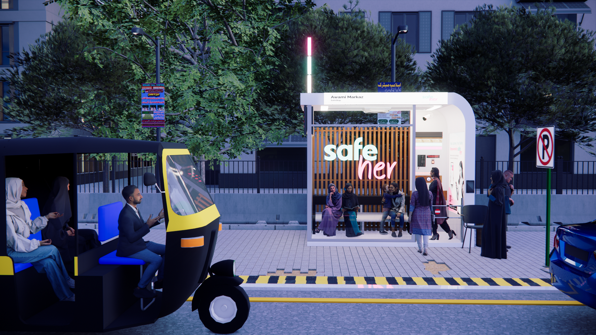 SafeStop · concept render
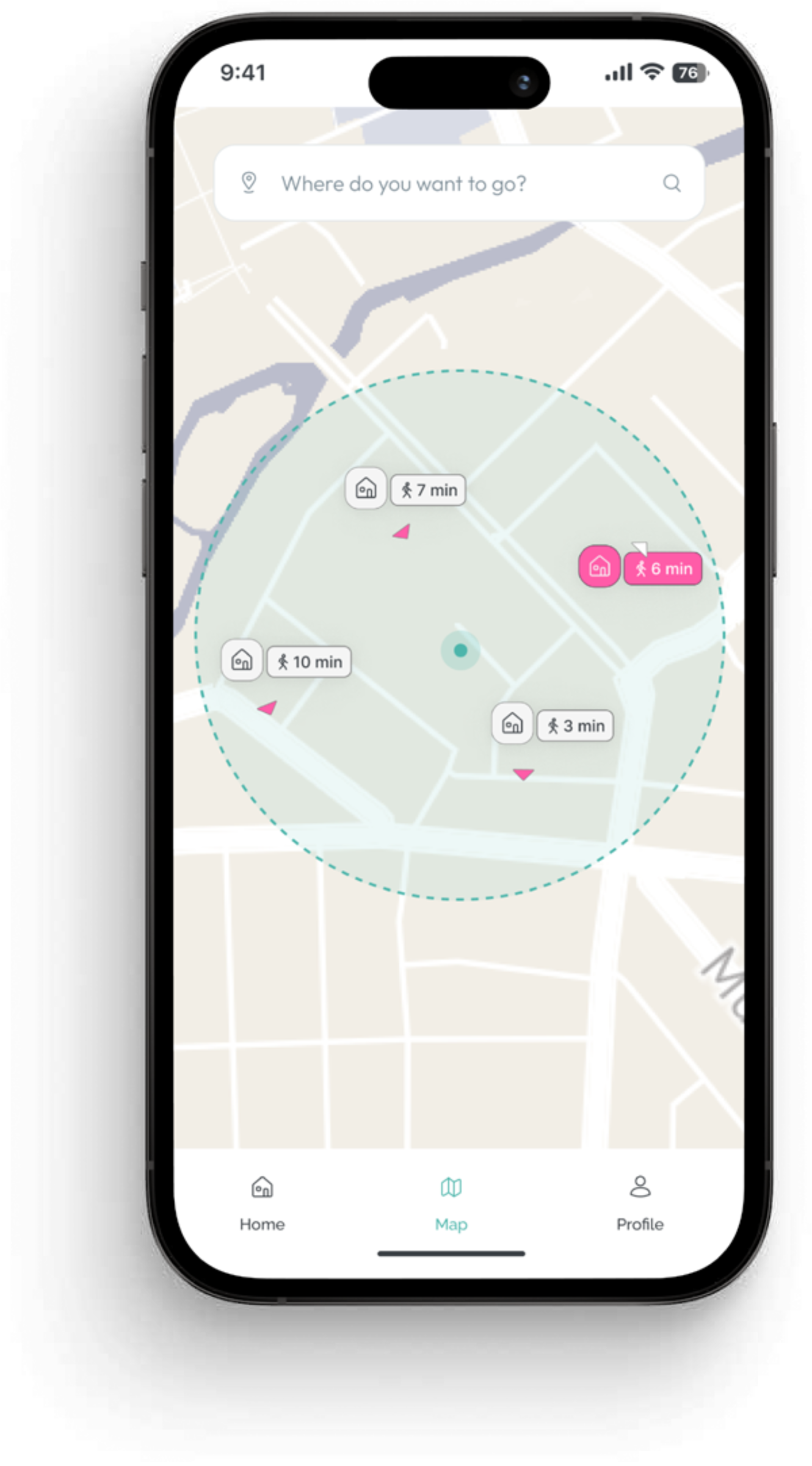
A connected service across physical, digital and operational layers.
SafeHer is not a single shelter or a single app. It works as a service, where a physical place, a digital companion and a supporting operation each depend on the others.
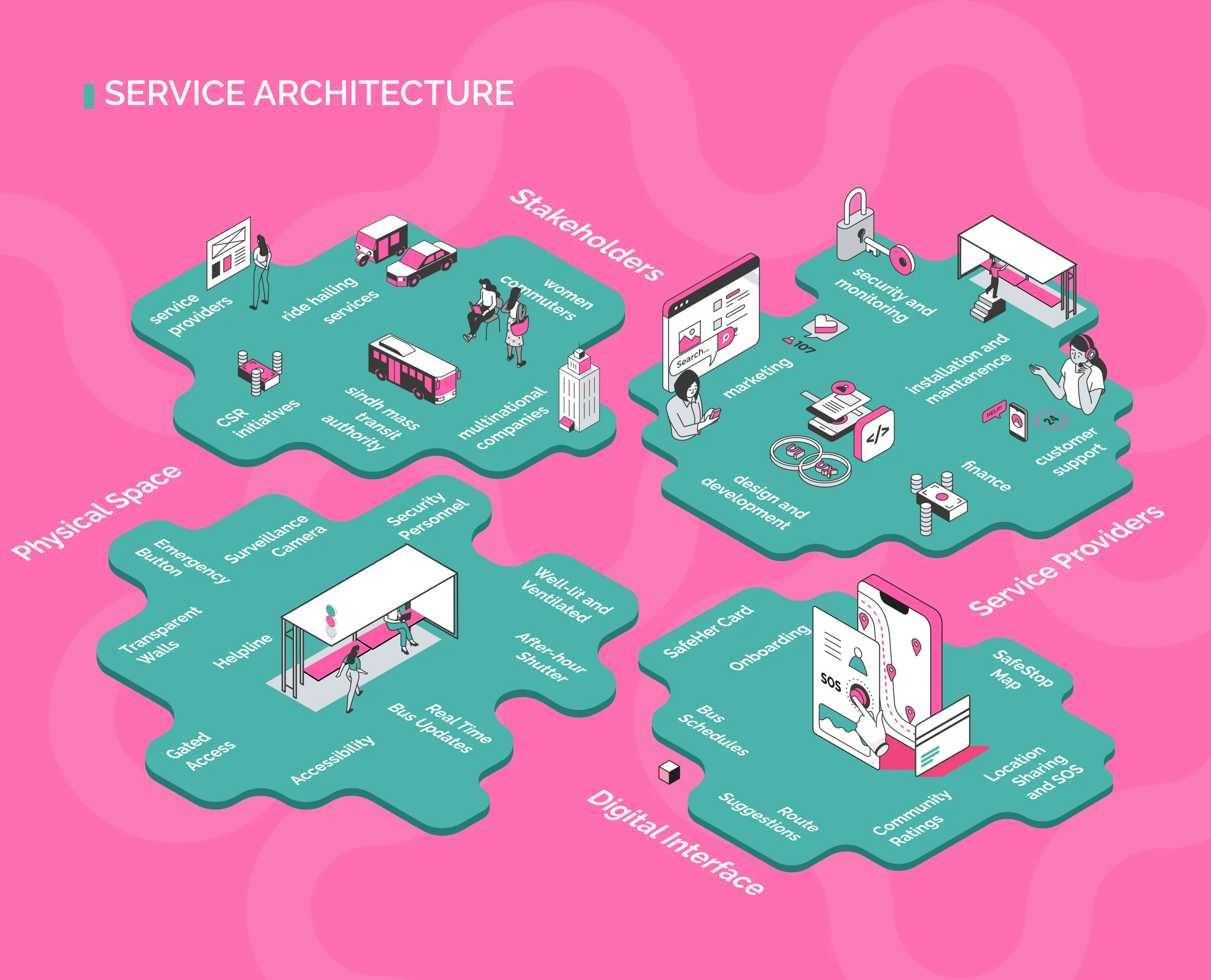
The SafeStop environment
A visible and defined place to wait.
The companion experience
Information and support before and during the wait.
The system behind the service
The partnerships and processes keeping it reliable.
Redesigning the place where waiting happens.
Research had pointed to the wait itself as the problem, so the environment changed first. Each of the four requirements met a specific finding from the field.
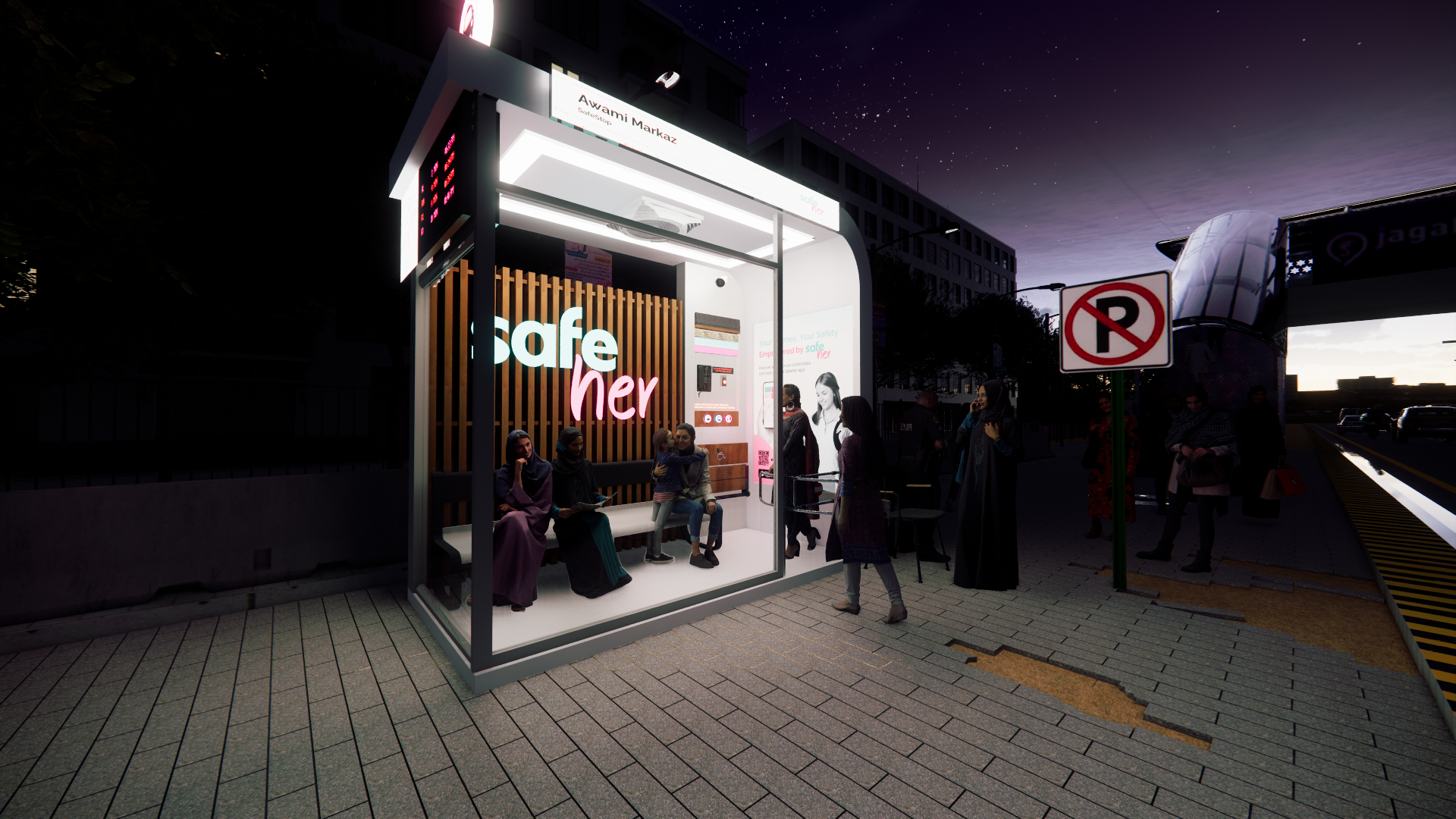 Concept render
Seen, without being exposed.
Uncertainty came from standing on the road exposed, without being able to read what was happening around them.
Transparent walls and a road-facing orientation let a commuter be seen and stay aware of the street, while the structure still separates her from it.
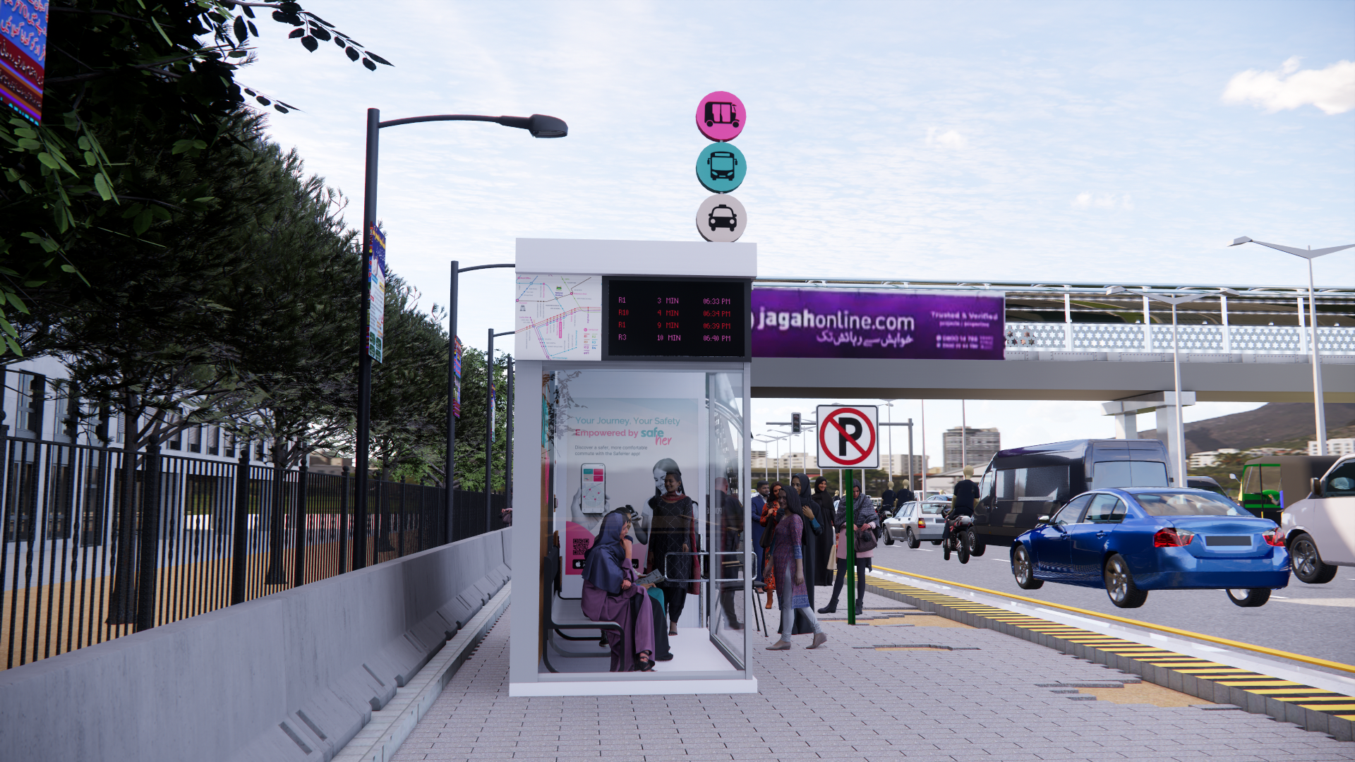 Concept render
Information where the waiting happens.
Waits felt open-ended because route and arrival information rarely reached the place where women were actually standing.
A schedule board, colour-coded routes and overhead ride signals bring arrival information into the stop itself.
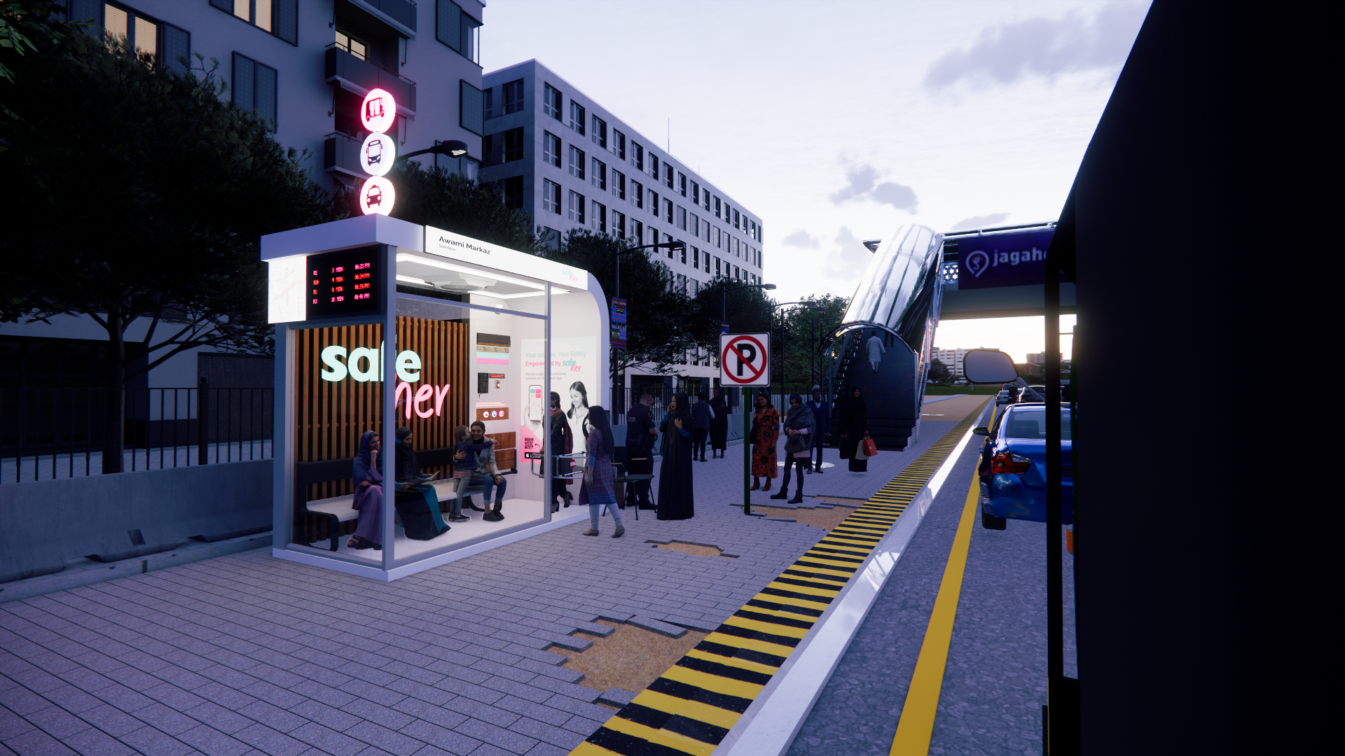 Concept render
A clear edge between waiting and boarding.
Women often had to step toward moving traffic to find or flag the ride they wanted.
A defined boarding edge and a signal button let a commuter wait inside and indicate her ride, instead of moving into the road.
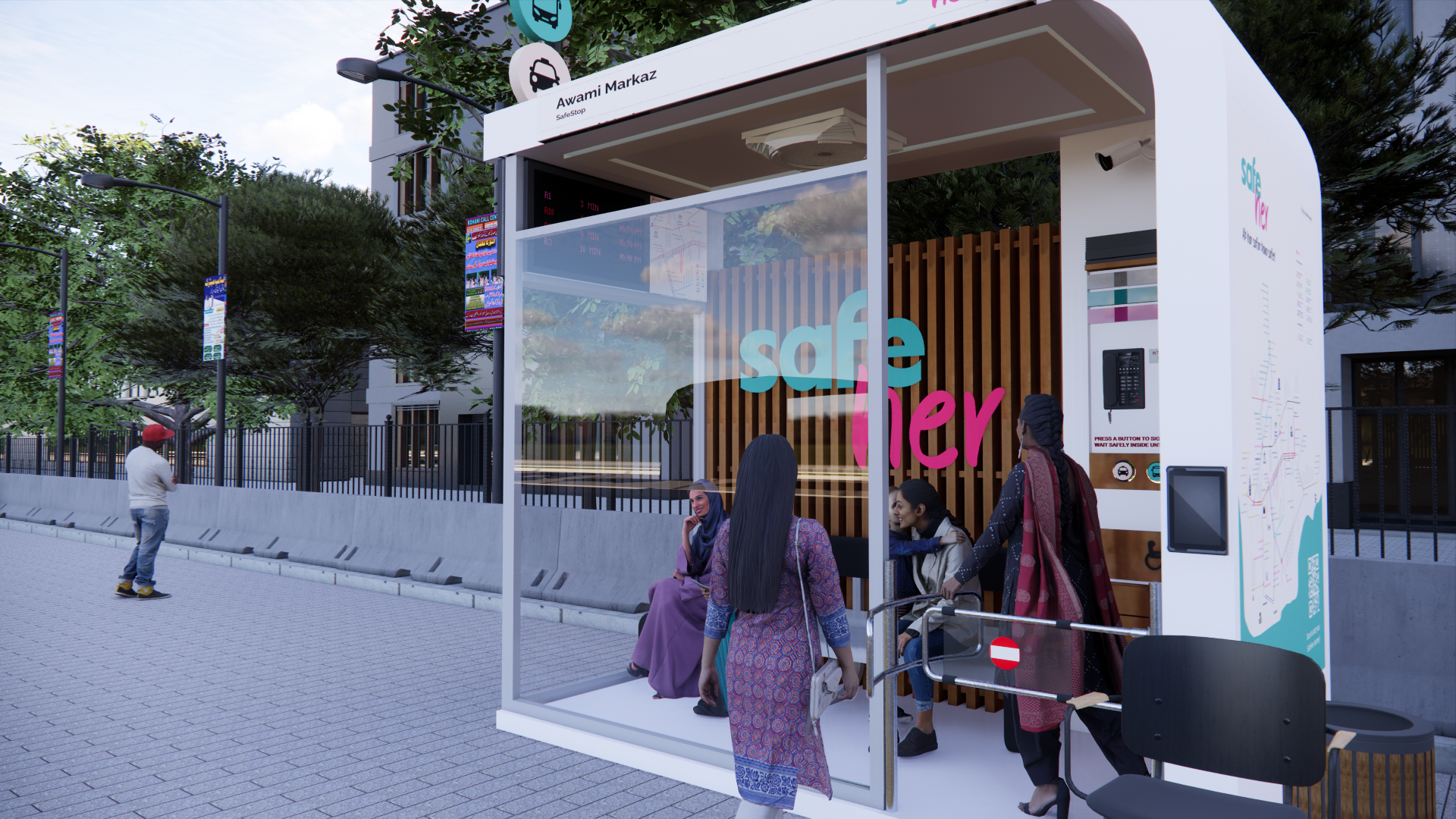 Concept render
Help within reach of the seat.
When something felt wrong, there was no obvious way to reach help from the roadside.
A built-in helpline, a check-in and accessible seating give a direct, visible way to ask for assistance.
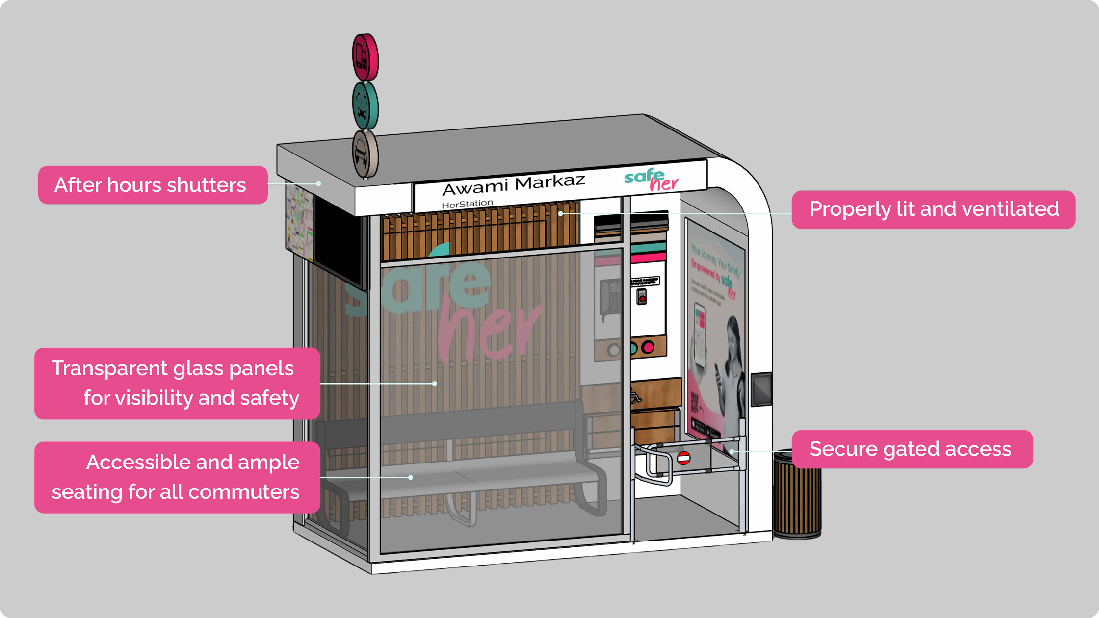
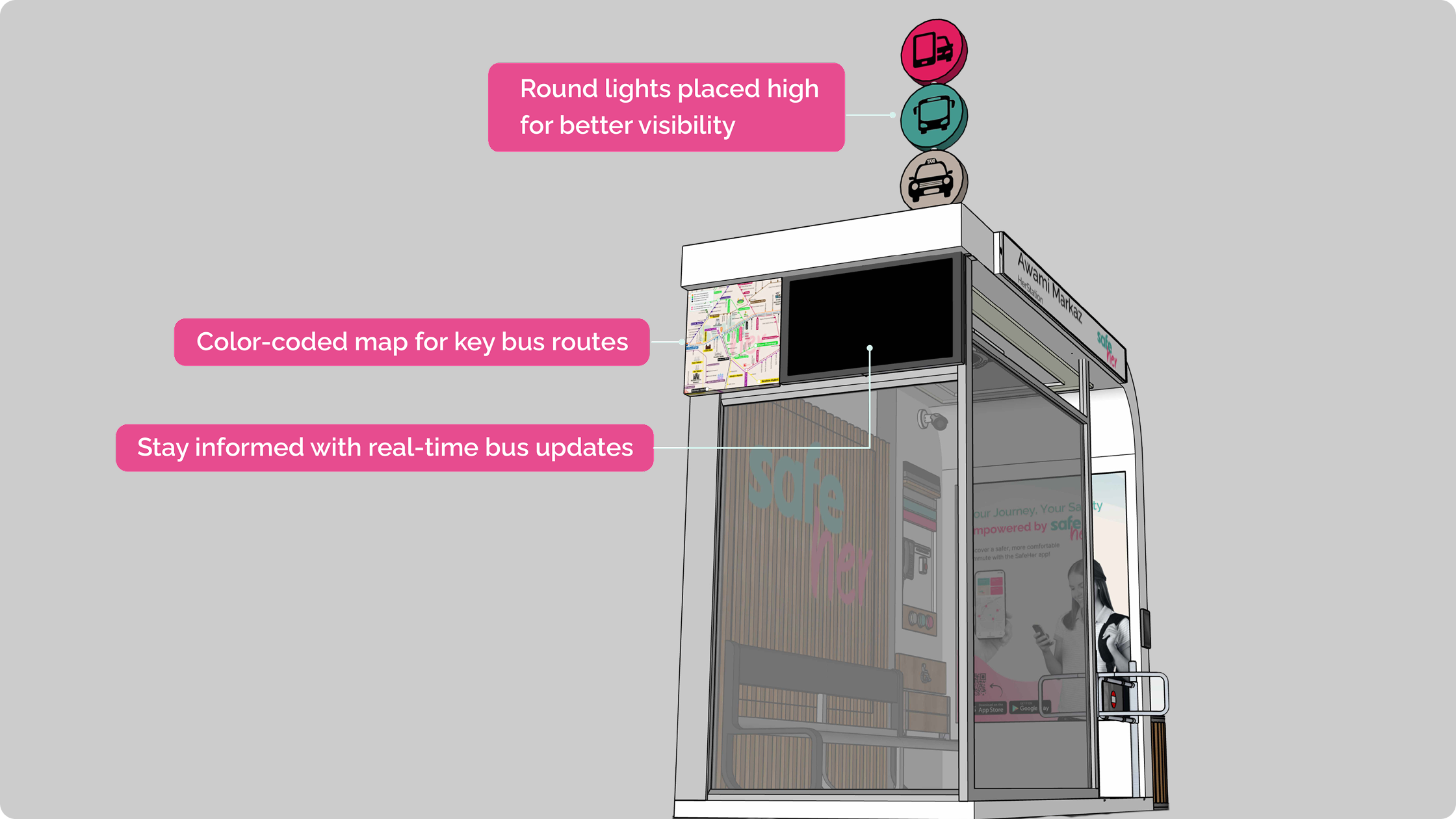
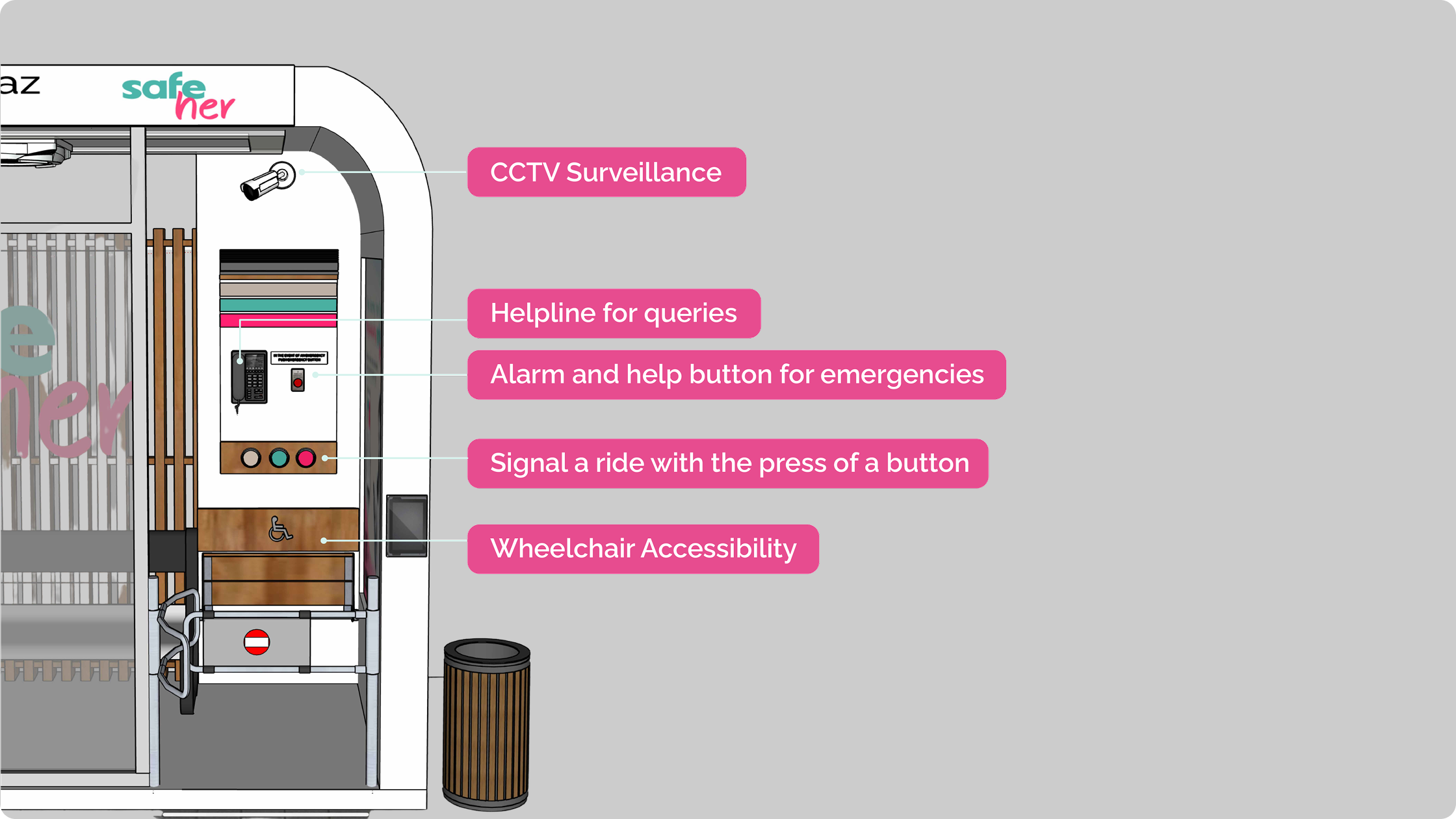
Developing a waiting environment around real constraints.
The stop did not begin as a connected environment. It started closer to a familiar reference and changed each time testing exposed a limit. Every version kept one principle and let the rest go.
A covered seat that protected women from sun, rain and the crowd.
Protection alone did not answer where the ride was or when it would come.
Shelter and seating stayed, but inside a connected environment rather than on their own.
Thin light strips along the frame to signal the incoming ride.
Drivers in traffic did not read the strips as a signal.
Signalling moved to round overhead lights, placed high enough to be seen from the road.
An entrance set on the sheltered side of the stop.
Parked bikes and rickshaws blocked the view of who was entering.
The entrance was repositioned to keep the approach and the boarding edge in clear view.
Solid panels for a sense of enclosure and privacy.
Women felt safer when they could be seen from outside, not hidden.
Walls became fully transparent, trading concealment for visibility.
Each change traded a first instinct for what testing showed women actually needed.
The digital layer extended support beyond the stop.
The app was framed around three moments of the wait. Every screen exists to remove a specific uncertainty, not to add a feature.
Help her prepare.
Removes the question: where do I wait, and does this route work?
- Find a nearby SafeStop
- Route information
- Journey planning

Reduce uncertainty.
Removes the question: is this the right stop, and is my ride still coming?
- Current stop confirmed
- Arrival and ride updates
- Check-in
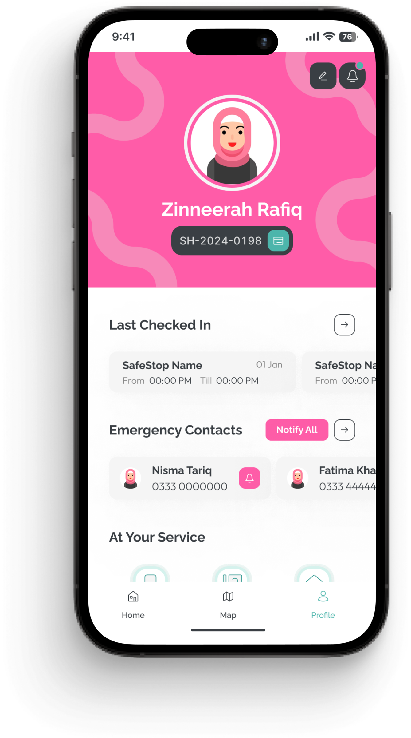
Give her control.
Removes the question: if plans change, who knows where I am?
- Trusted contacts
- Location sharing
- Support
Four screens carry the whole service idea.
Not every screen, only the ones that move a woman through the journey. Waiting mode sits at the centre, because the wait is the point everything else is built around.
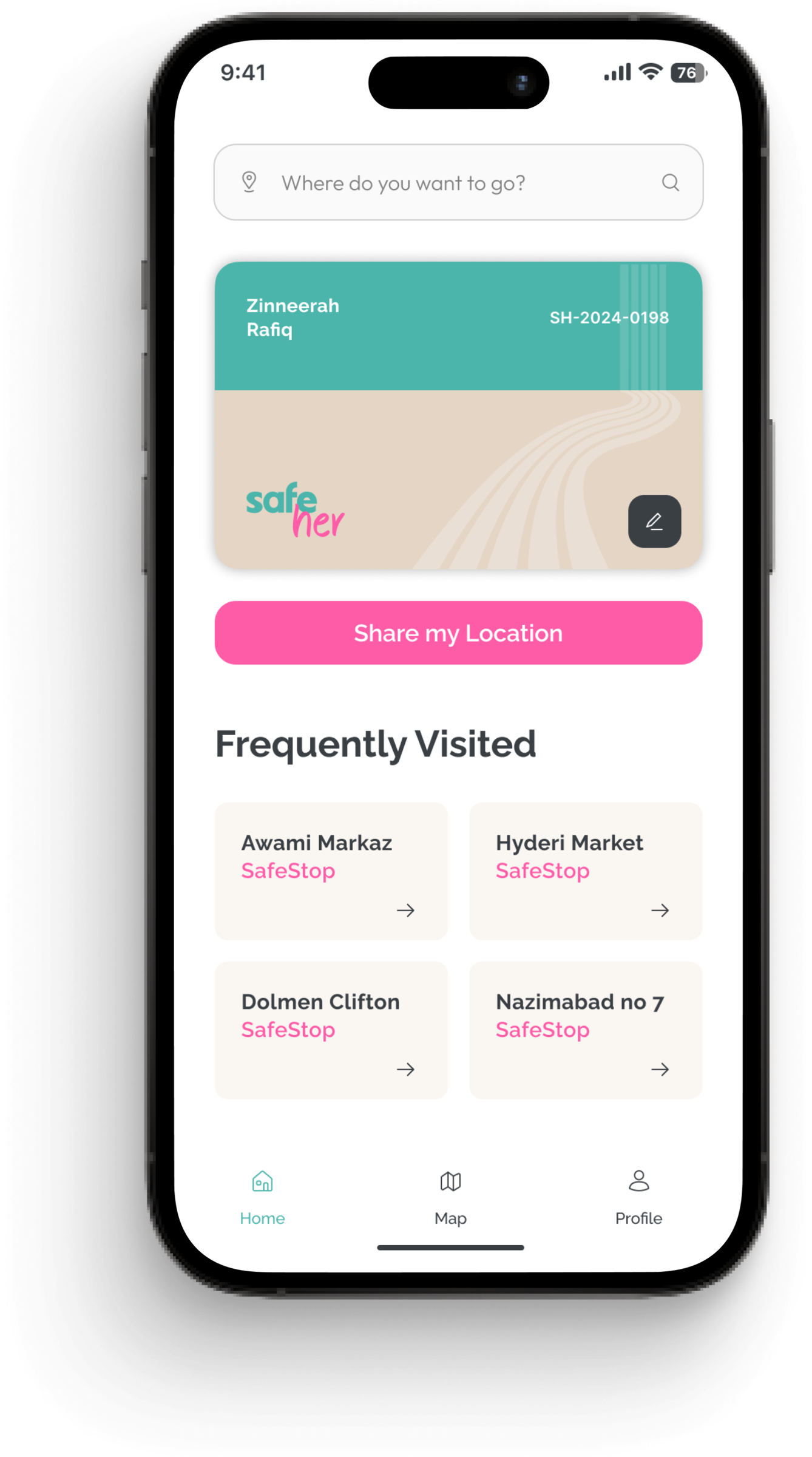
The starting point for the journey, built around her membership.
Connects her to physical SafeStops nearby, each with a walk time.
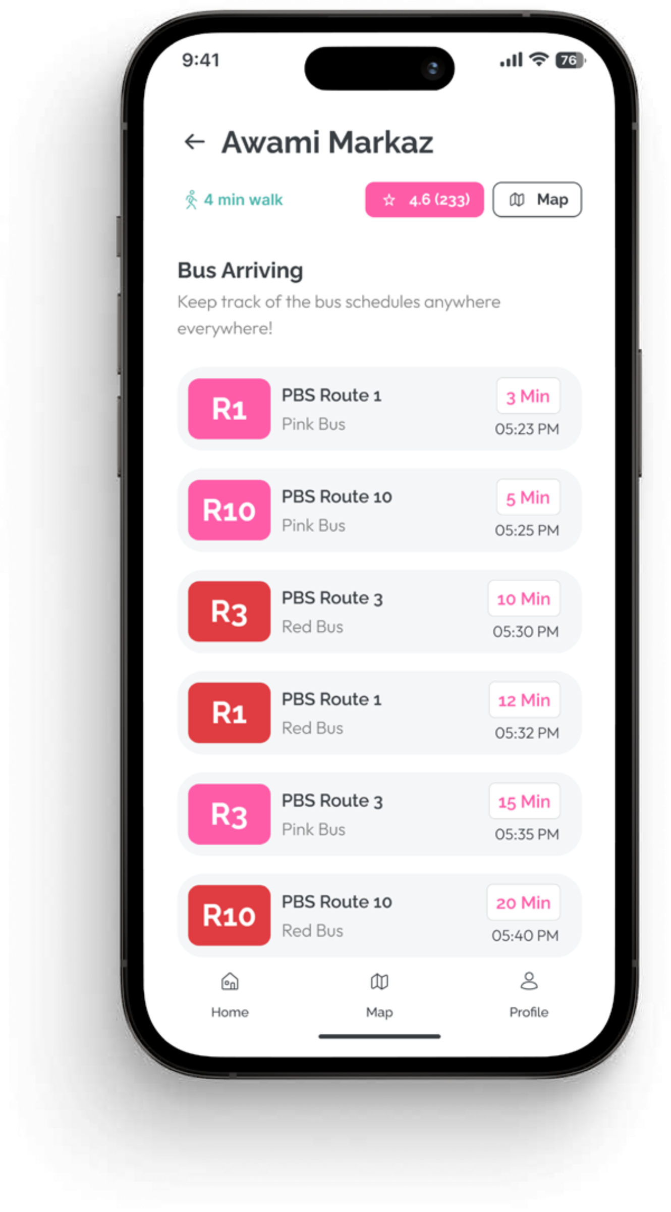
Live arrivals at the stop. The screen that carries the wait itself.
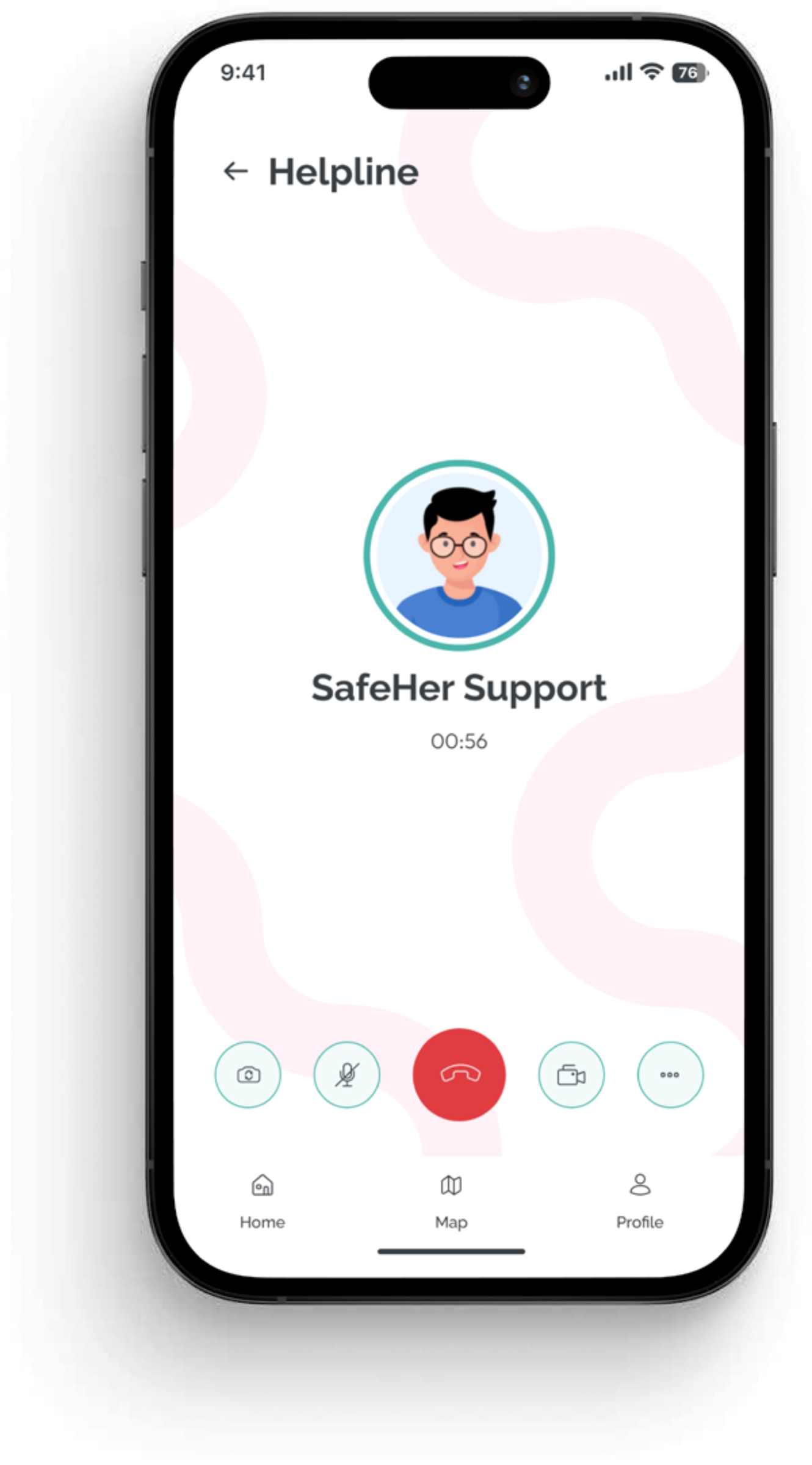
A direct line to assistance, one tap from anywhere in the app.
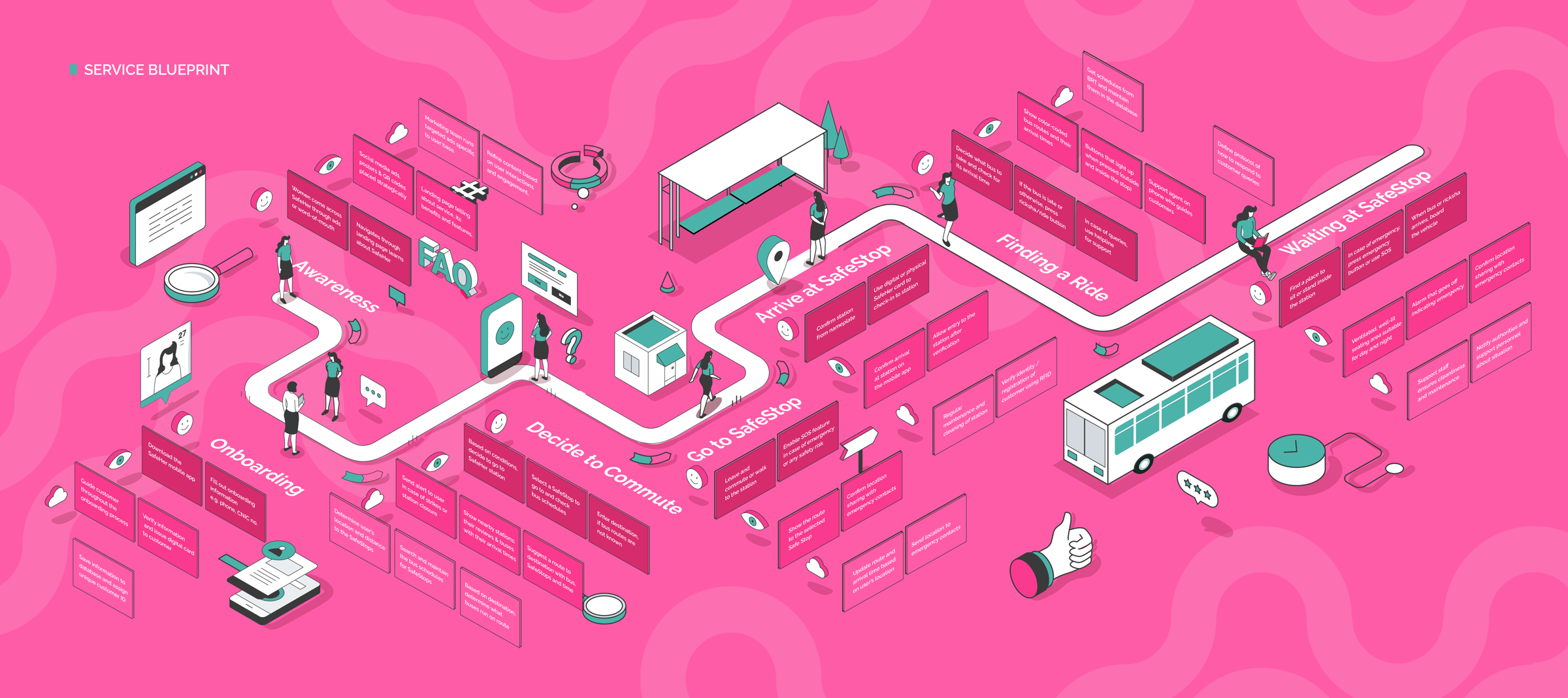
The concept holds together as a system, not a set of features.
A blueprint kept the layers in sync, so what a commuter sees on the surface is backed by something that keeps it running.
The final direction was checked against the original problems.
Each finding from the earlier chapters was mapped to the part of the service that answered it.
Unclear where to wait
Defined SafeStop locations
Long, uncertain waits
Arrival information at the stop
Feeling exposed on the road
A visible, transparent waiting environment
Stepping into traffic to board
A defined boarding edge and ride signal
No clear way to reach help
Check-in, helpline and location sharing
Each pairing shows what the design responded to and was reviewed against. It reflects how the concept was tested and discussed with women commuters, not a measured field study.
SafeHer turned waiting from an uncertain gap into a supported part of the journey.
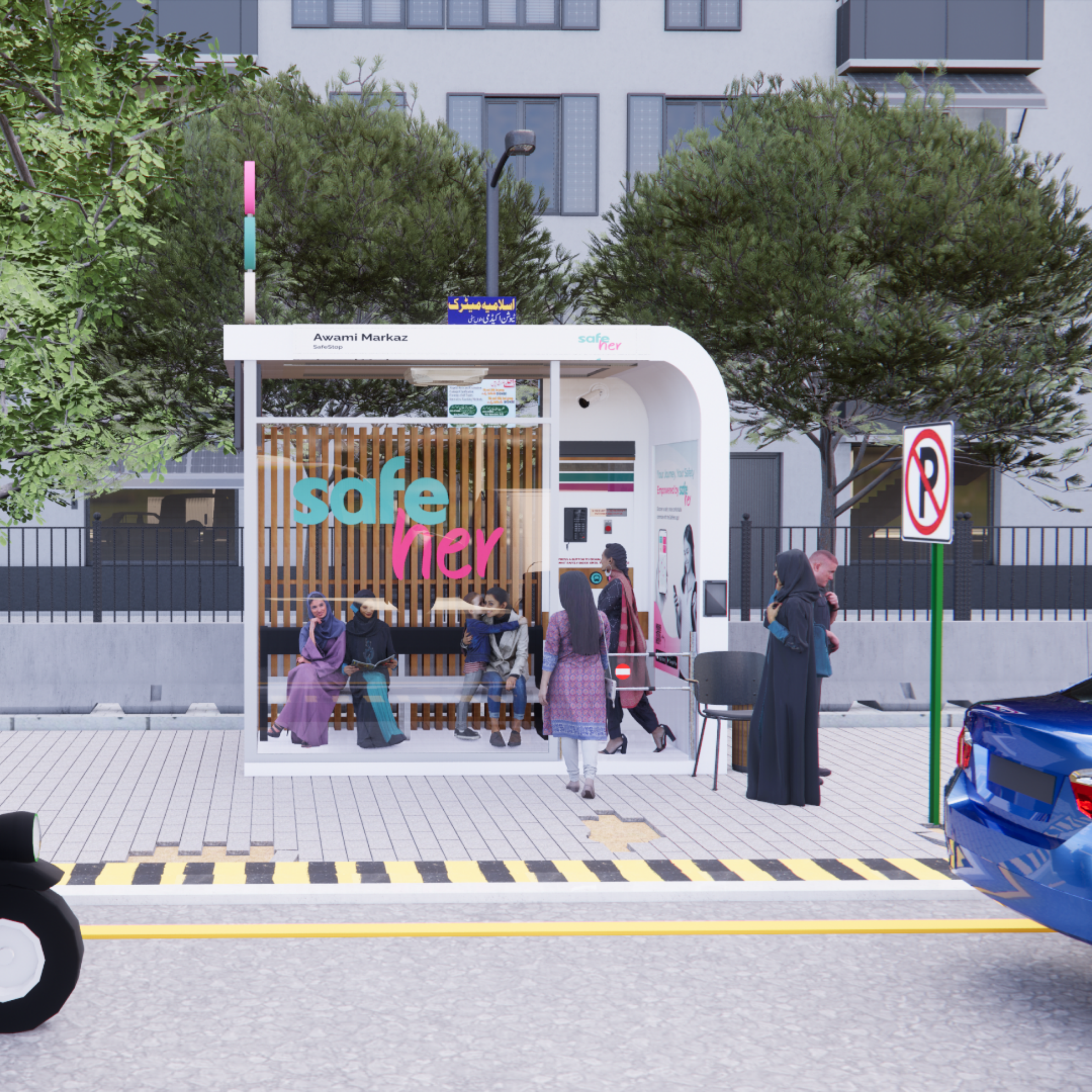
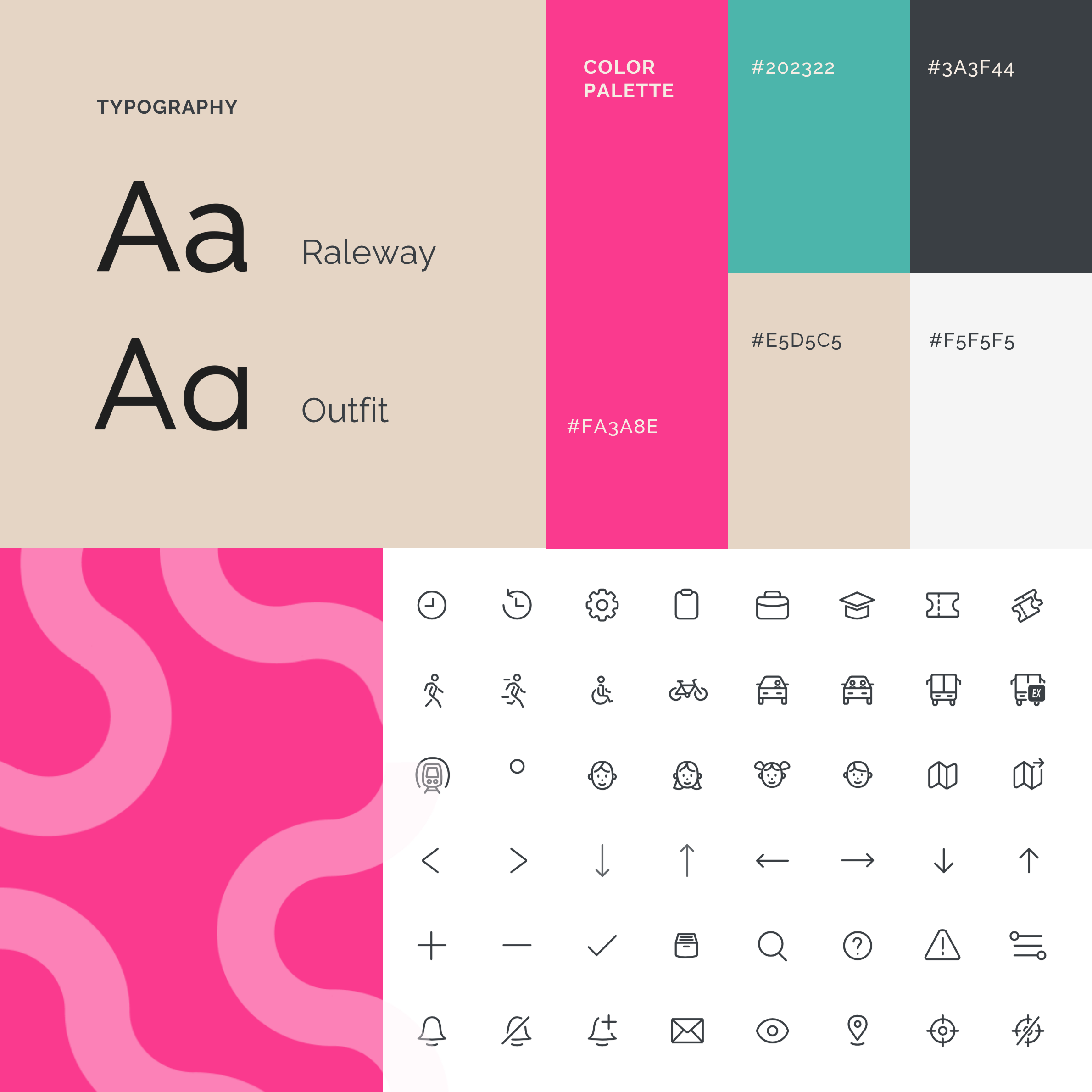
The resolved concept brings the physical stop, the app and the visual system together as one service, and it was tested in public at the IVS Degree Show.
From community response to real-world impact.
Women recognised the need.
Before the service existed, women already understood the problem. Sharing the concept online triggered conversations from commuters who related to unsafe waiting experiences and expressed interest in a safer alternative.
women joined the waiting list
people reached through sharing
of those who responded wanted to join
A problem that resonated beyond the target users.
The project also gained attention within the design community, with professionals recognising the importance of addressing women's safety and mobility through service design.
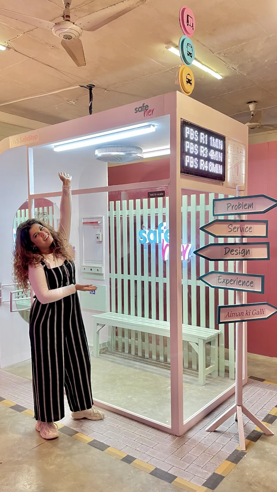
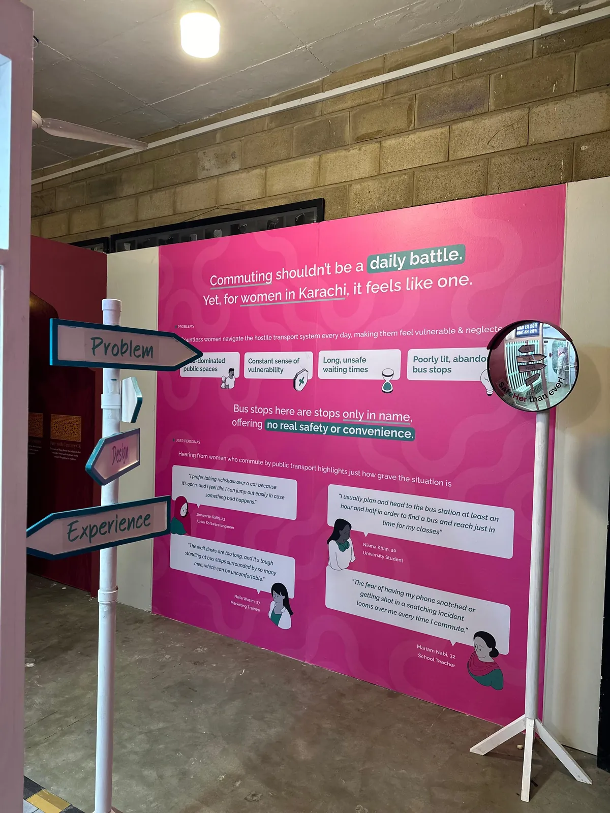
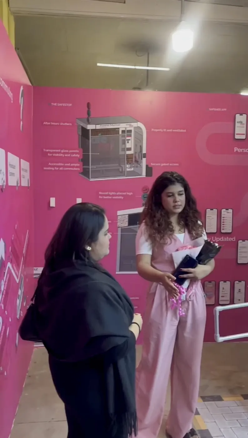
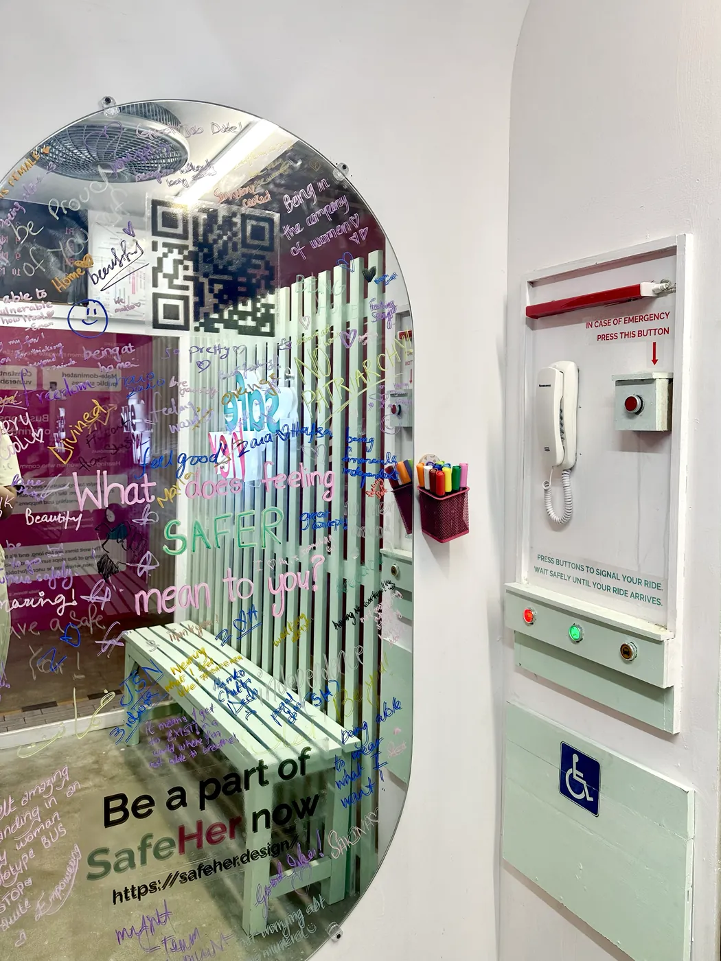
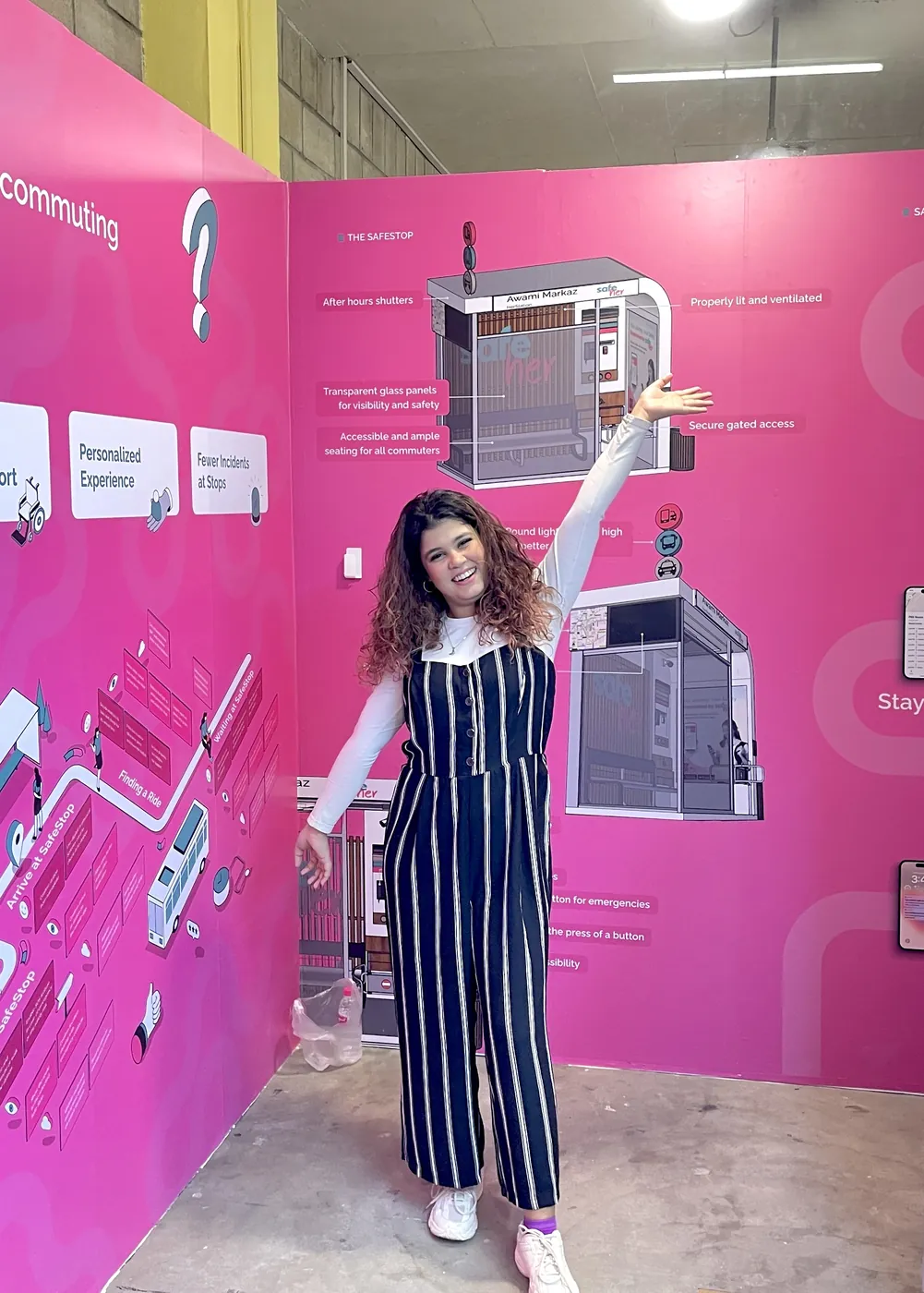
A service people could experience, not only imagine.
The exhibition transformed SafeHer into a physical service experience, allowing visitors to explore the SafeStop environment and engage with the proposed journey.
A conversation that continued beyond the exhibition.
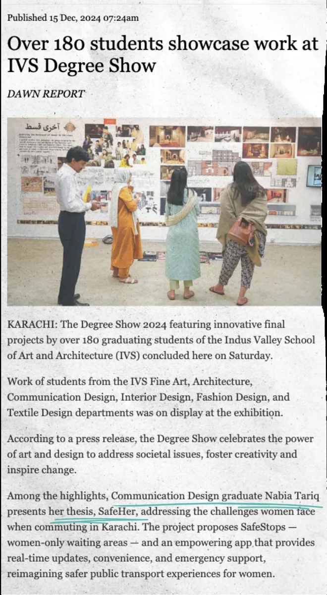
"Among the highlights, Communication Design graduate Nabia Tariq presents her thesis, SafeHer, addressing the challenges women face when commuting in Karachi. The project proposes SafeStops — women-only waiting areas — and an empowering app that provides real-time updates, convenience, and emergency support, reimagining safer public transport experiences for women."
Read the articlePolicy attention. The concept was also recognised by Sharjeel Memon, Senior Minister of Transport & Mass Transit, Sindh, as a scalable public safety idea for women commuting in Karachi.
Designing safety as a service, not a feature.
SafeHer started with a simple question: what if waiting for public transport did not have to feel unsafe? Through research, service design and prototyping, the project explored how physical spaces, digital tools and community support can work together to create more confident journeys.
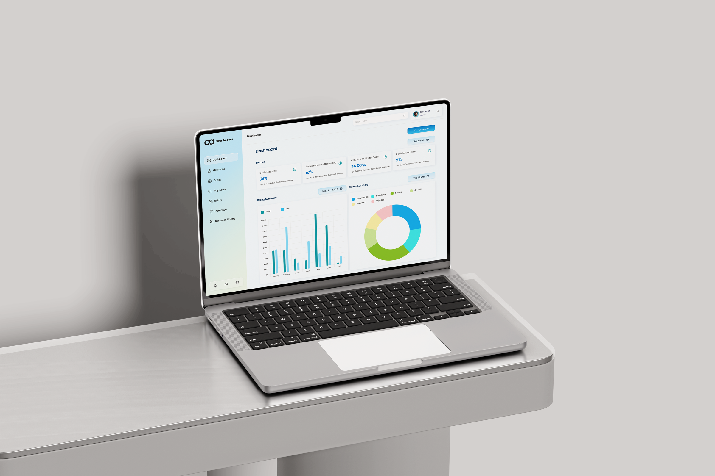
One platform for every role in an ABA practice — replacing a tab-switching workflow with a single, role-aware system from intake to discharge.
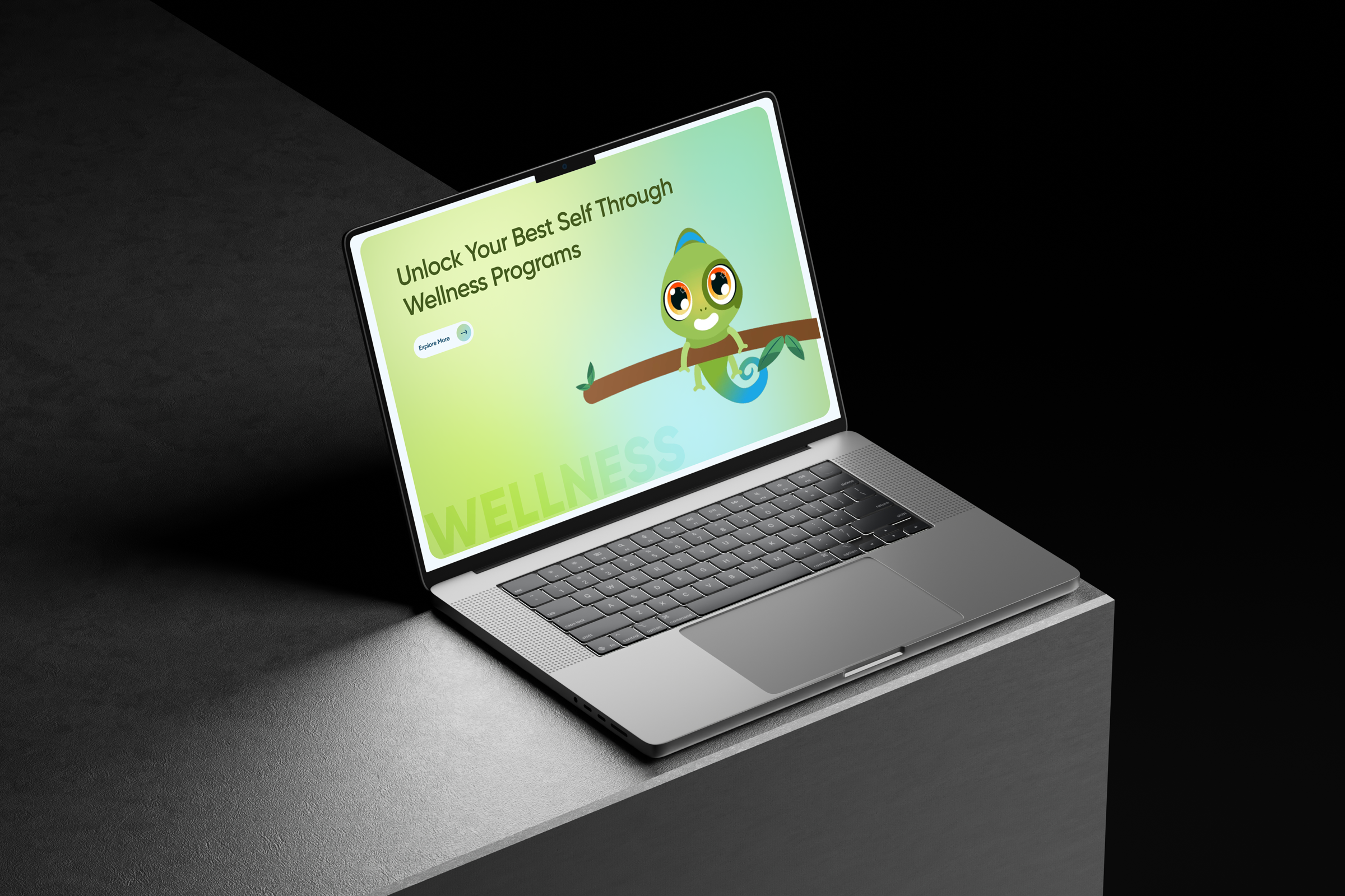
A website rebuild and brand identity for an ABA practice — turning a stack of isolated pages into a service that visitors actually move through.