access behavior analysis.
A website rebuild and brand identity for an ABA practice — turning a stack of isolated pages into a service that visitors actually move through.
The site existed. It just didn't work as a site.
Access Behavior Analysis offers four very different services — clinical ABA, certifications and CEUs, wellness programs, and B2B partnerships — but the website handed every visitor the same flat menu and hoped they'd figure it out. There was no story, no structure, and no reason to stay.
Five gaps that made every page leak. None of them were visual.
Before any redesign, we audited what the site was — and what it wasn't. The visual style sat at the surface; the deeper problems were structural.
Navigation with no direction
The menu listed pages, not journeys. Visitors landed somewhere generic and left from there.
No SEO, no architecture
Pages weren't built to be found. Search engines saw the same shallow tree visitors did.
Branding by section
Each service used its own visual language — the brand fragmented every time you clicked.
Pages without conversion
No clear next step. Forms hidden, CTAs buried, value propositions left to the visitor to assemble.
Infrastructure that couldn't grow
New services meant new one-off pages. Wellness, OBM, Knowledge Center had no surface to plug into.
rebuild the site so each service has its own journey, the brand reads as one identity, and every page leads somewhere on purpose?
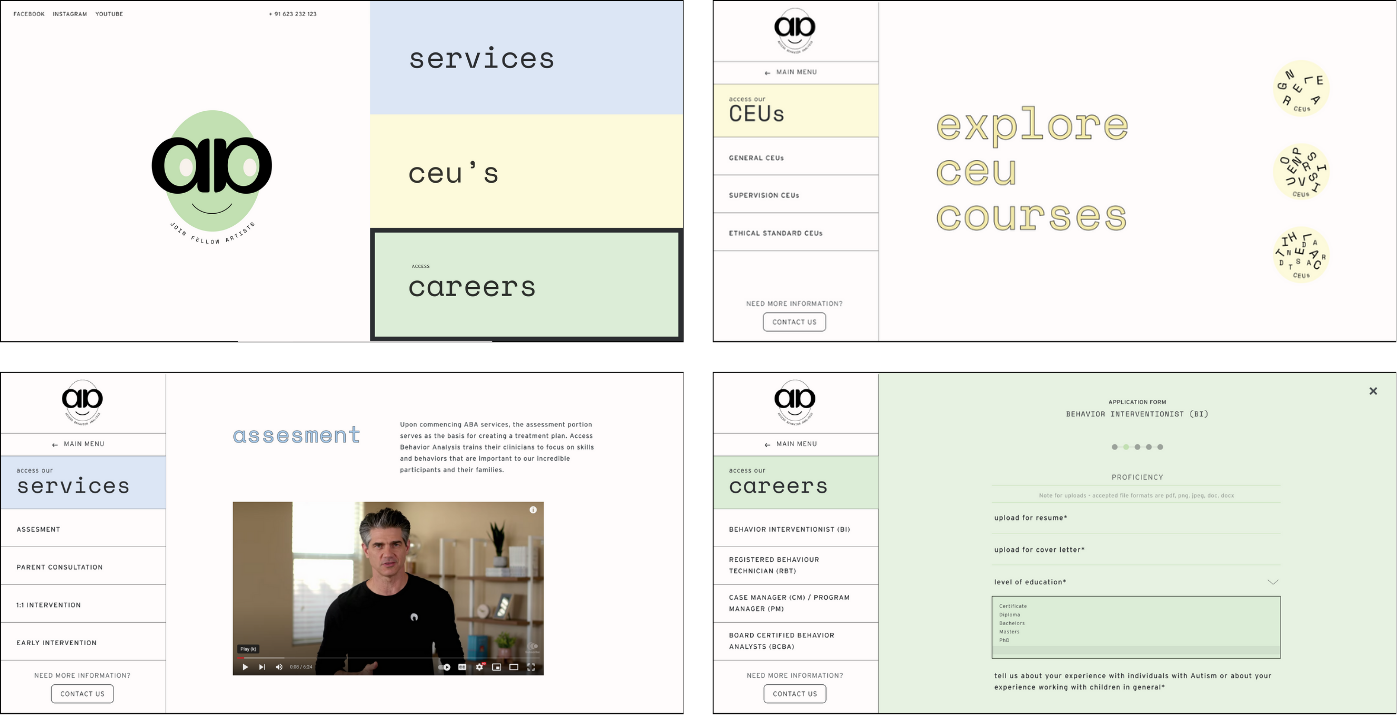
Four services. Four journeys. One visual system.
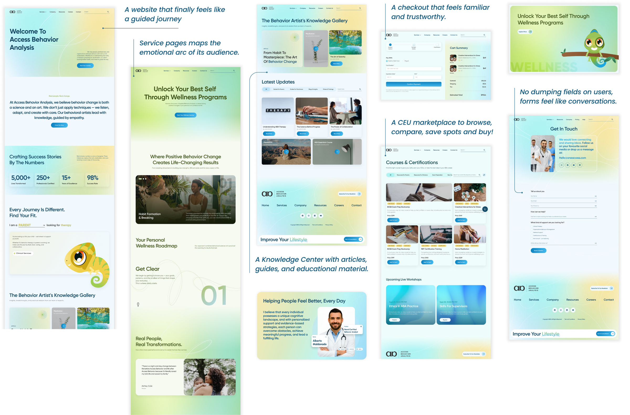
Instead of stacking everything under one menu, we split the site into service-specific journeys — each with its own audience, its own page flow, and its own conversion goal — held together by a single brand system that travels across all of them.
For families seeking ABA
Assessment-led intake, plain-language explainers, clinician profiles, scheduling.
For BCBAs & RBTs
CEU marketplace — browse, compare, save, and buy. Not a PDF list.
For adults building habits
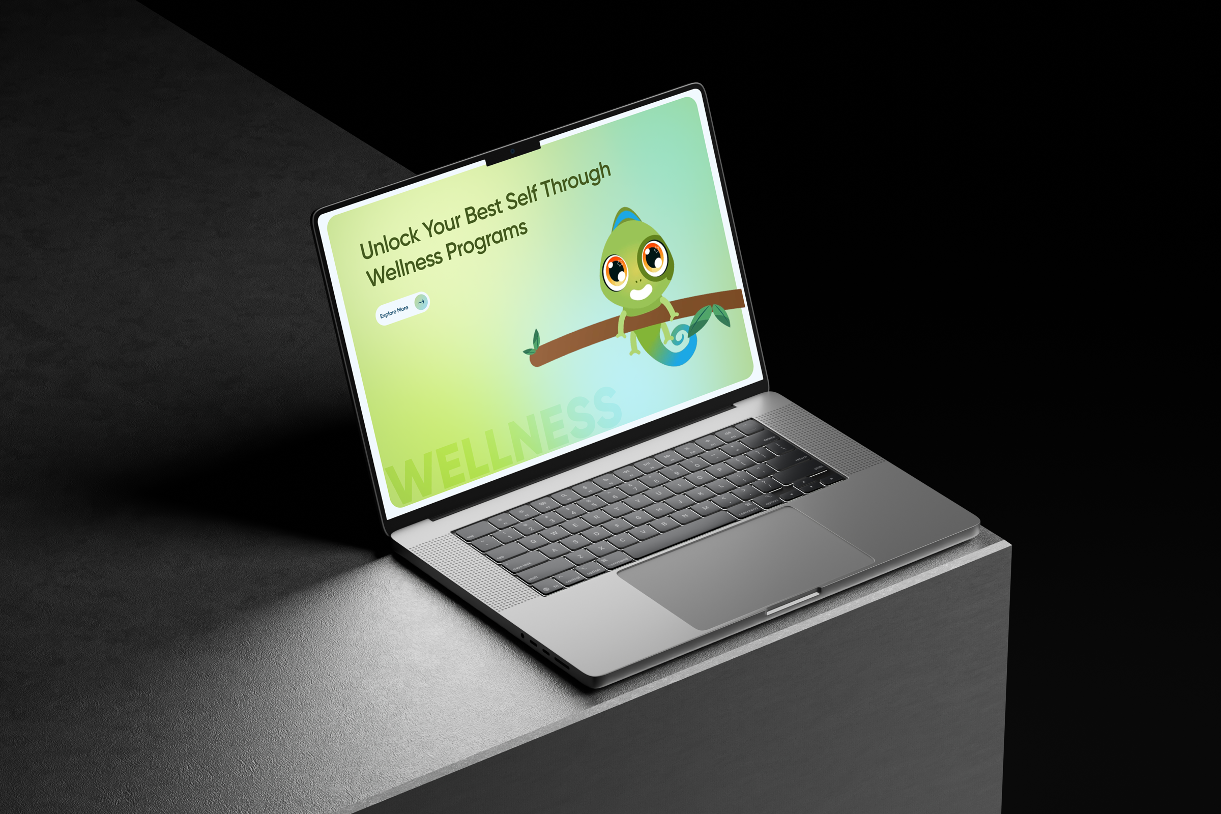
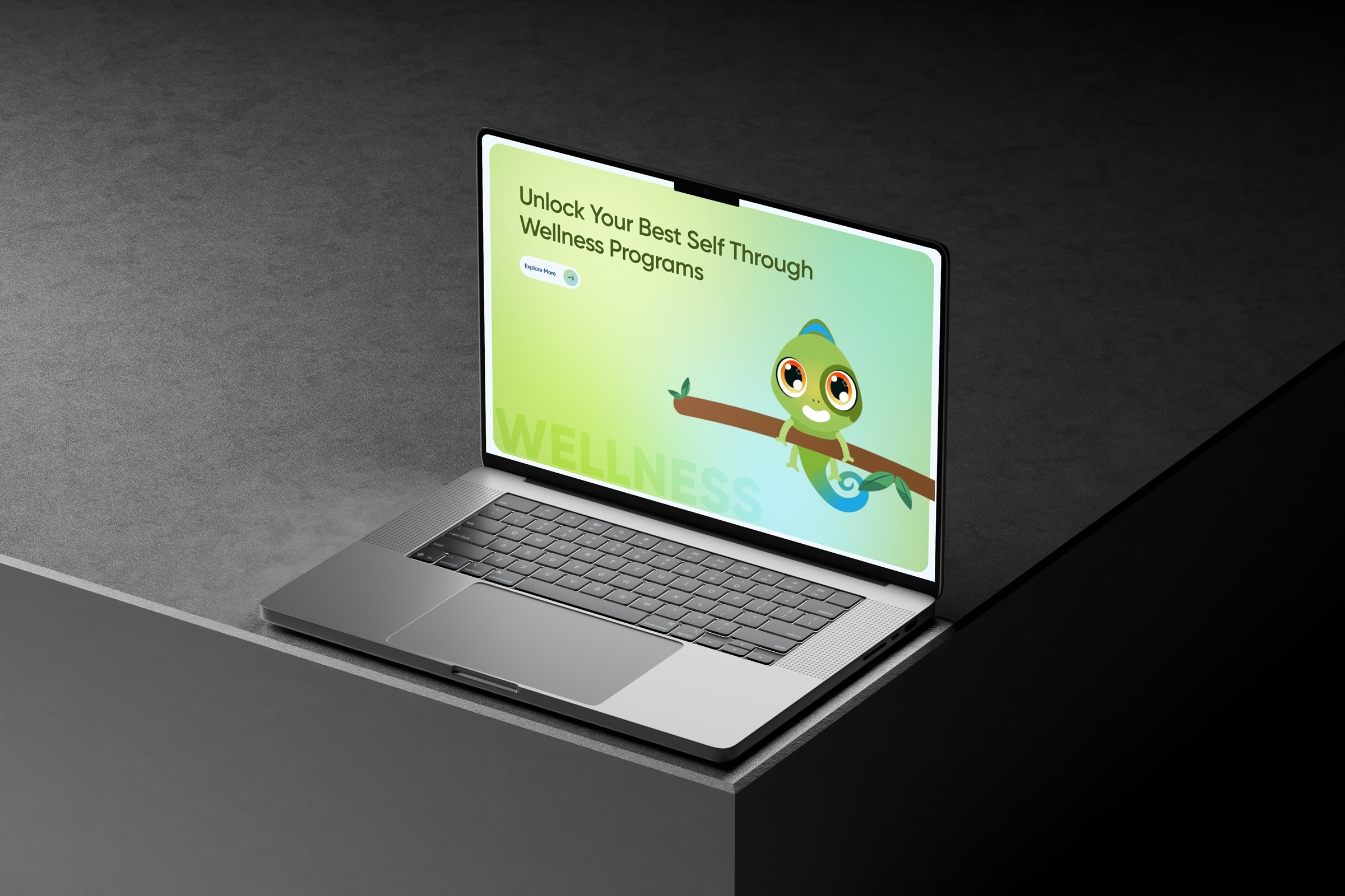
Personal wellness roadmap with the chameleon as guide — softer voice, lifestyle frame.
For schools & clinics
Partnership offers, OBM consulting, Knowledge Center — sales-shaped pages, not a brochure.
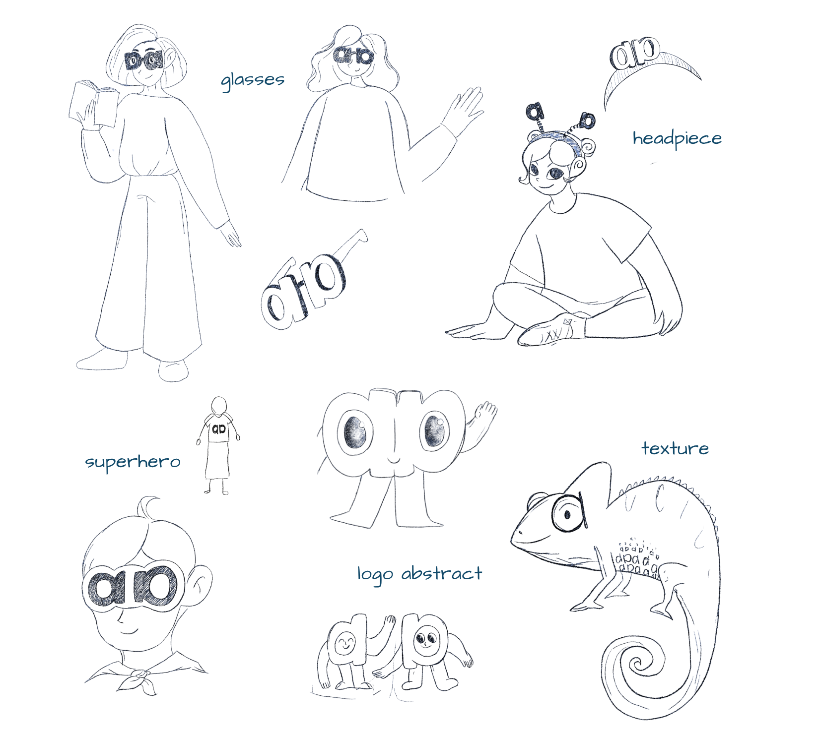
We needed a guide, not a logo. Meet Cleo.
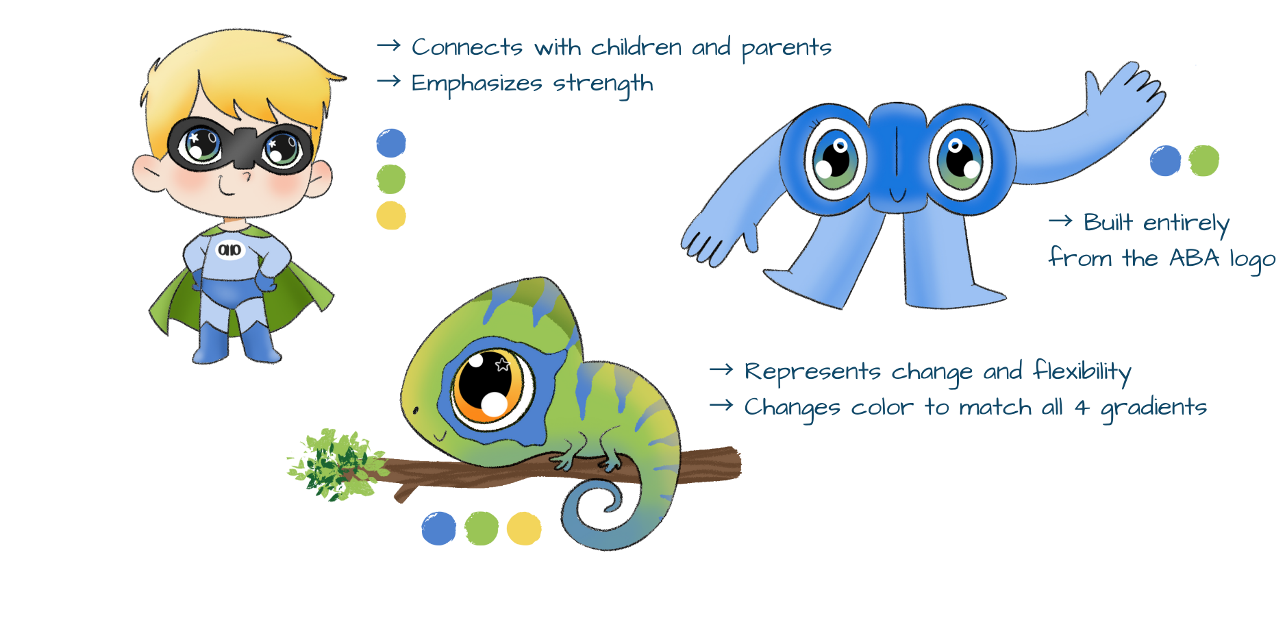
The brand needed someone — something — that could walk a visitor across four very different services without changing tone. We sketched superheroes, researchers, headpiece characters, and abstract logo creatures. The chameleon won on first principles: behaviour analysis is the study of how behaviour adapts to environment. A chameleon literally is that.
A guide that earns its place on every page.
- Represents behavioural adaptation — the chameleon literally embodies what ABA studies.
- Age-neutral and culture-neutral — works for a parent, a clinician, or a corporate partner.
- Acts as a navigational guide — walks the visitor through the site without feeling juvenile.
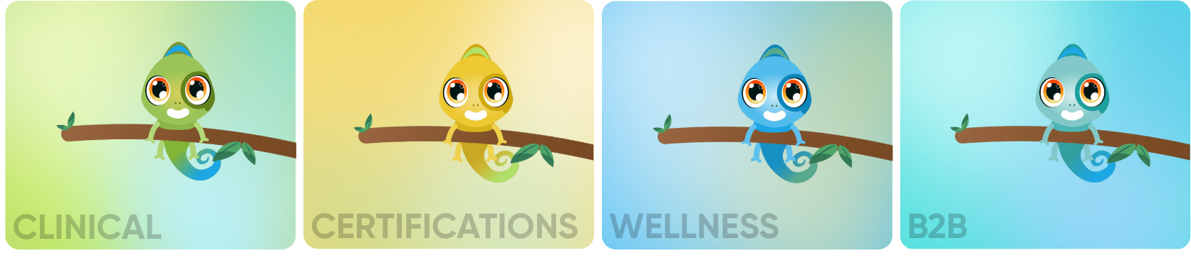
- Changes colour to match each service — the same character, the same voice, four lenses.
Same Cleo. Four gradients.
Each service got a gradient — Clinical green, Certifications yellow, Wellness teal, B2B blue. The mascot adopts the colour of whichever journey the visitor is in, so the page they're on always reads as "this is the part of the site that's for you."
Every page does one job.
Hero earns the click, body answers the question, conversion sits on the page where the visitor's interest is highest — not three screens later. The same template structure runs across all four services; only the content and the gradient change.
From 30 inbound leads a month to 120–150.
The redesigned site shipped as the new front door for the practice — and the numbers moved past curiosity, into pipeline.
Inbound leads per month
From ~30/month to 120–150/month — without a change in ad spend.
service journeys, each with its own colour, gradient, and conversion goal.
scalable system that absorbed three new service surfaces without redesign.
growth in inbound leads — from ~30/month to 120–150/month, no ad-spend change.
One brand, four journeys
Cleo + the gradient system carry the visitor through four very different audiences without the brand losing itself.
Conversion-shaped pages
Every page earns its CTA. Forms feel like conversations; pricing and value sit where interest peaks.
Built to add
New services plug into the system instead of breaking it — Wellness, OBM, and Knowledge Center shipped without a redesign.
A mascot is a brand decision, not a styling one. Cleo earned the brief.
The hardest decision on this project wasn't the colour system or the page templates — it was committing to a character. A mascot anchors a tone and limits a brand at the same time. Picking a chameleon because behaviour analysis is the study of adaptation made the rest of the system fall into place: the colour shifts, the cross-service consistency, the warmth that a clinical practice usually lacks online — all of it followed from that one decision.
A service designed around women's safety in Karachi — moving past a single panic button to map the full ecosystem of trust, response, and aftercare.
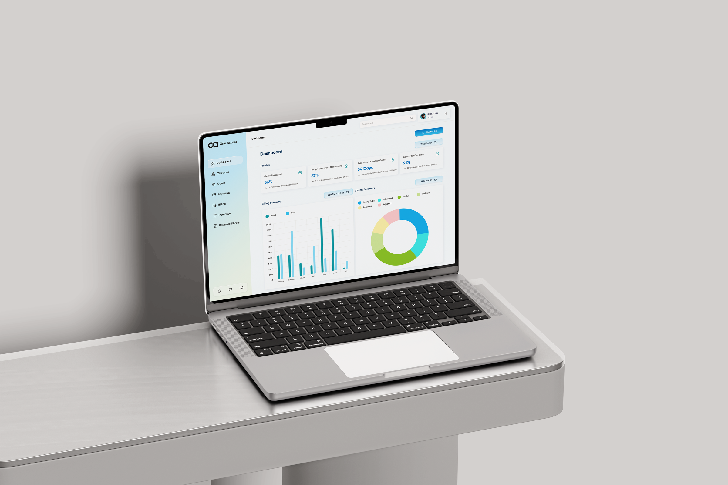
One platform for every role in an ABA practice — replacing a tab-switching workflow with a single, role-aware system from intake to discharge.