proathletic.
A growing cricket academy with real potential — held back by an identity that changed every time you looked. One brand, and a digital home to replace registration by DM.
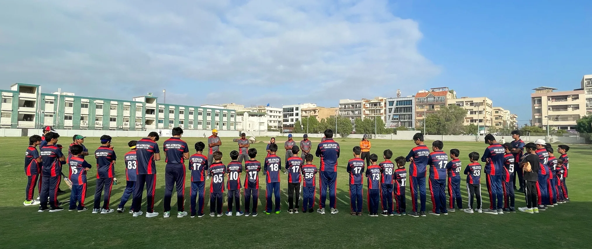
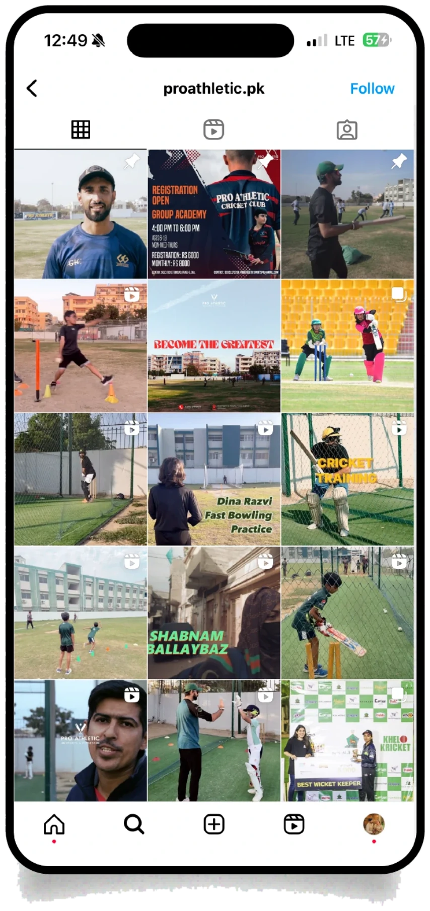
A real academy that never looked like one.
ProAthletic, a cricket training academy, had the things that matter — players, coaches, parents, a proper program. What it didn’t have was a way to look like a single organisation twice in a row. Colours, logos, and messaging shifted from post to post, and there was no website to send anyone to.
One academy, wearing three brands.

A maroon and a blue that never matched the kit, a logo that vanished at avatar size, and no rule for when to use what. Recognisable brands repeat themselves; this one reset every post.
Three problems sat underneath it.
The one thing worth building everything around.
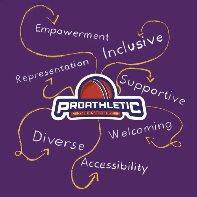
Before a single colour was chosen, we found the idea the brand actually stood for. ProAthletic wasn’t the most elite academy in the city — it was the most open one. That became the brief: an identity that looks like it belongs to everybody.

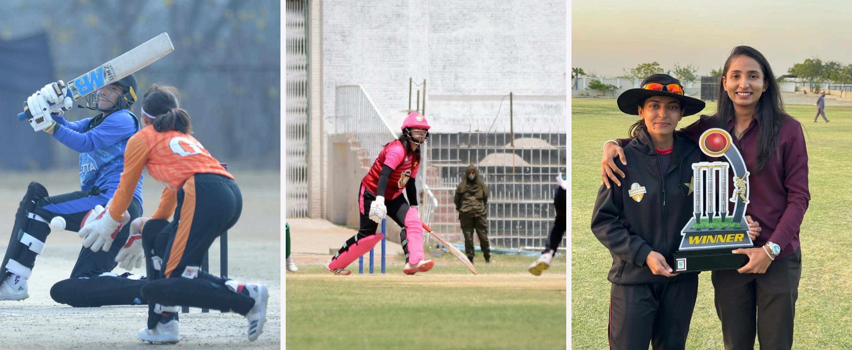
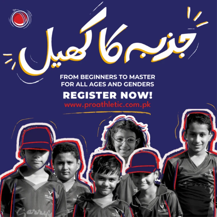
A cricket platform for everybody — regardless of age, gender, or background.
And for the girls and women too often left off the team sheet, that means something specific: women coaches, a hijab-friendly kit, and a real route into competitive cricket — backing that follows a player from the nets to trials.
Where “everybody” counts the most.
In Pakistan, women’s cricket has had almost no grassroots ladder to climb. The first domestic contracts for women players arrived only in 2023, and most girls reach the game in spite of cultural and financial barriers, not because a system was waiting for them. So an academy that genuinely opens the door to women isn’t a marketing angle here — it’s the sharpest proof the brand means what it says.
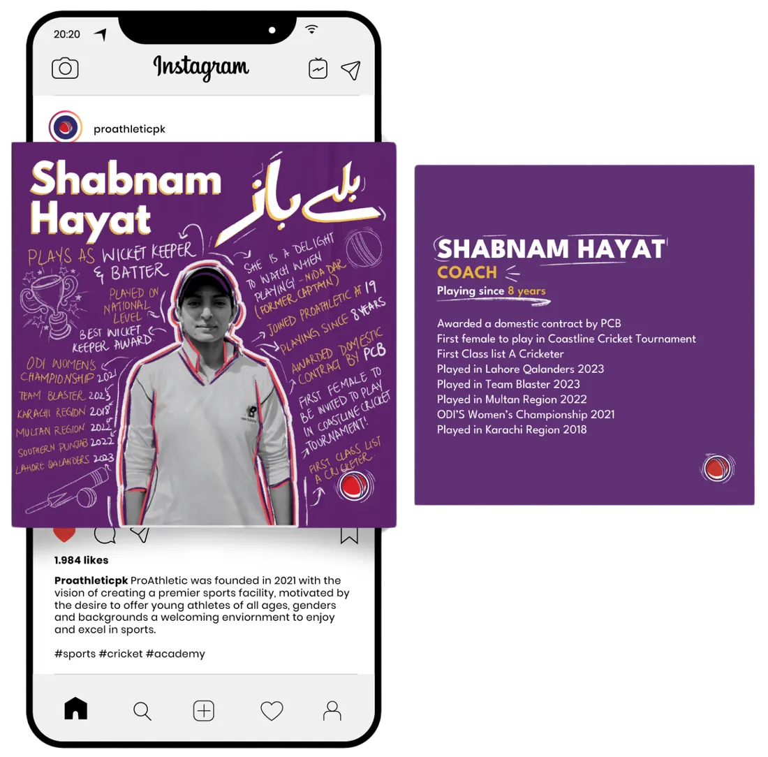
“ProAthletic was there for me even when my family wasn’t. They saw the passion in me as a young girl, trained me, and sponsored me for trials when I had no money to travel on my own.”Shabnam HayatFemale trainer & player, ProAthletic
Support you can point to, not just claim.
- Women’s training squads, coached by women.
- A hijab-friendly kit designed in from the start — not adapted later.
- Register online, on your own — no gatekeeper, no DM, no permission slip.
- A pathway that carries players from the nets to competitive trials.
give the academy one identity it can’t drift from — open enough for everybody, and a place to register that isn’t a DM thread?
One identity, built to travel.
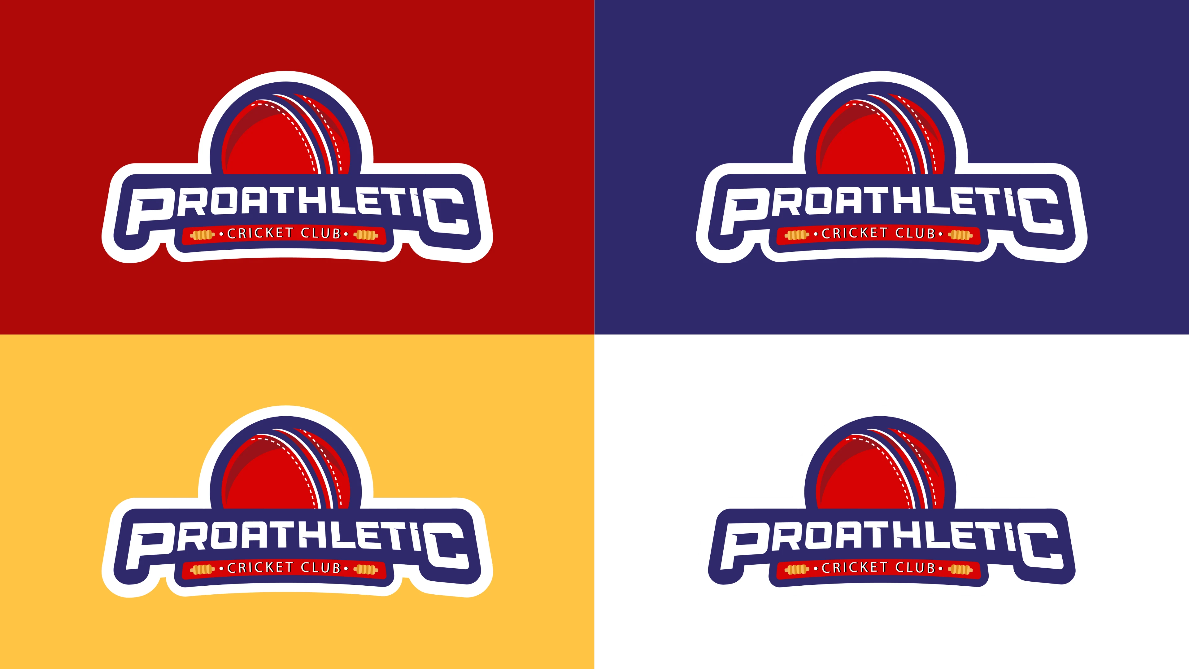
Four colours, fixed. A competitive red pulled straight from the cricket ball, a deep navy to anchor it, a warm gold for the wins, and an off-white to let the badge breathe. Every artifact — kit, cards, posts — is built from this and nothing else, so the academy can’t drift again.
A dozen directions, looking for one that could take a hit.
We sketched the wordmark every way we could — bats, balls, stumps, monograms — hunting for something bold enough for a competitive sports brand and simple enough to survive a tiny Instagram avatar.

One emblem, locked to take the field.
A confident badge — a cricket ball cresting over the PROATHLETIC wordmark — locked up so it holds on red, navy, gold, or white without losing itself. One mark the academy could put on anything.
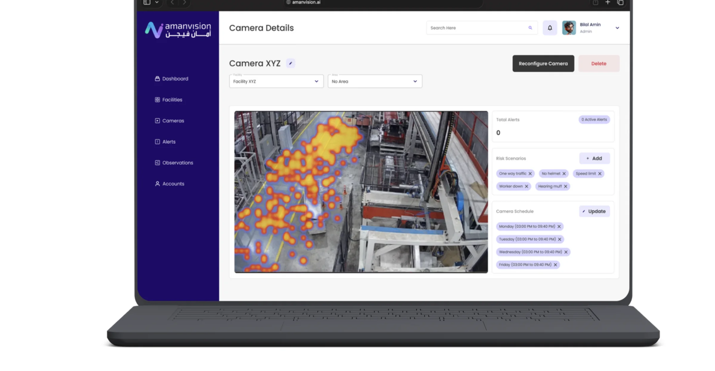
A digital home to replace the DM.
We mapped the parent’s journey — from a word-of-mouth first impression to registration — and built a centralised site around it: programs, schedules, announcements, and a sign-up flow that finally lives somewhere other than the Instagram inbox.
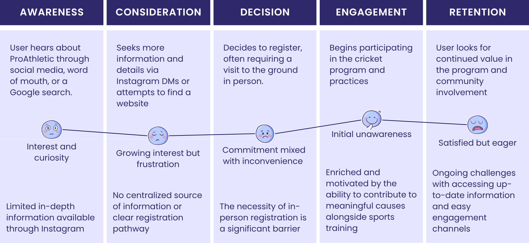


One front door, finally.
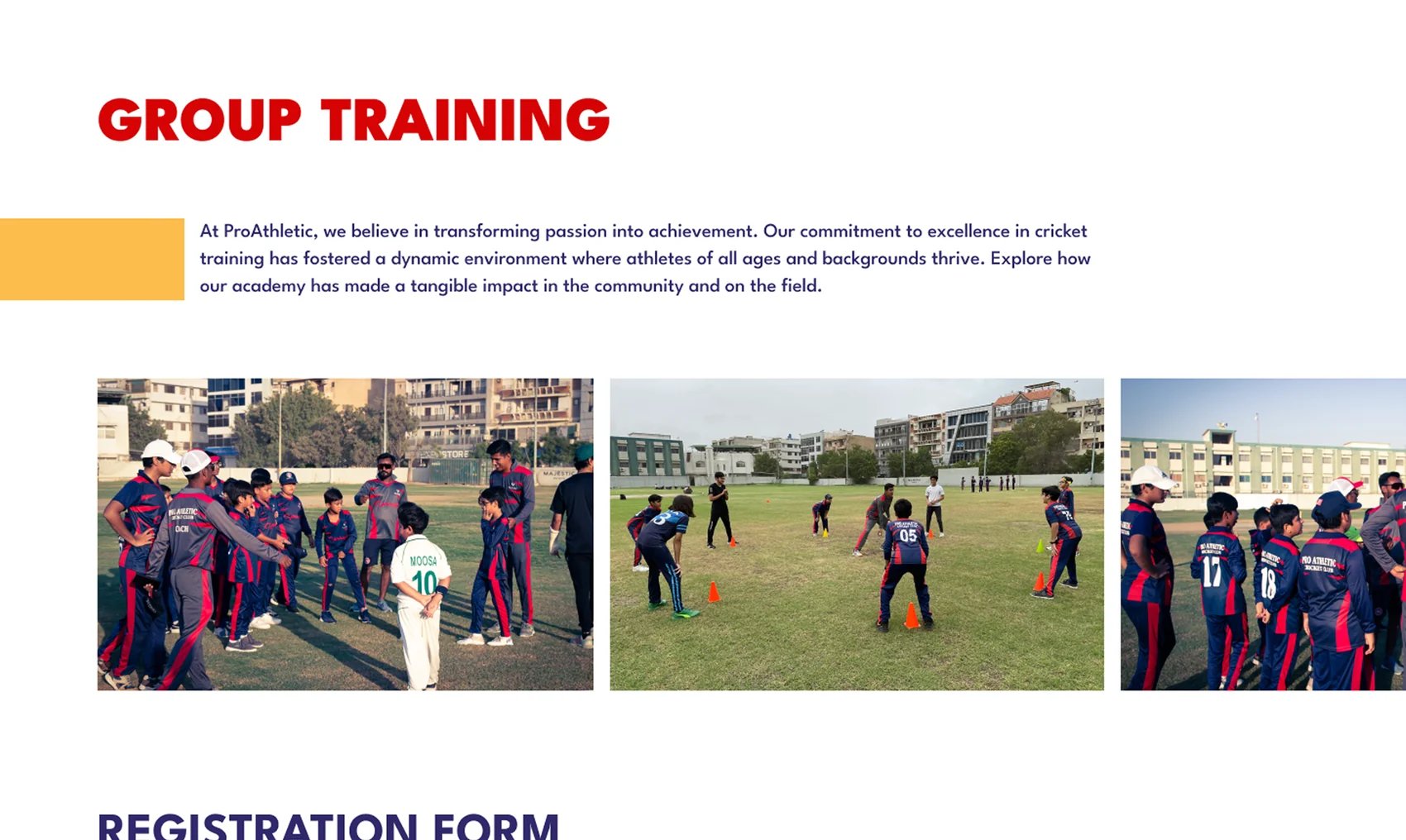
Hero, mission, and what the academy actually offers — 1-on-1, group, and net practice — so anyone who lands knows what ProAthletic is in five seconds.
The why behind the club.
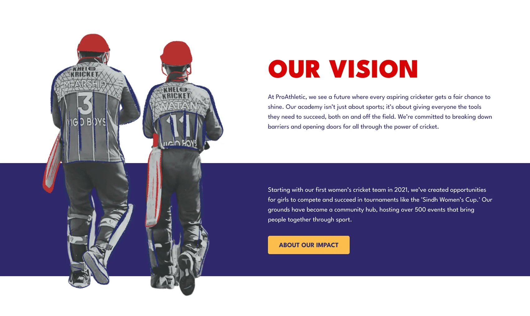
Our Vision — a fair chance for every aspiring cricketer, the first women’s team since 2021, and 500+ events that turned the ground into a community.
Pick a program, then sign up.
Each program laid out with fees and timings, flowing straight into a registration form — no DM required.
A sign-up that lives somewhere real.
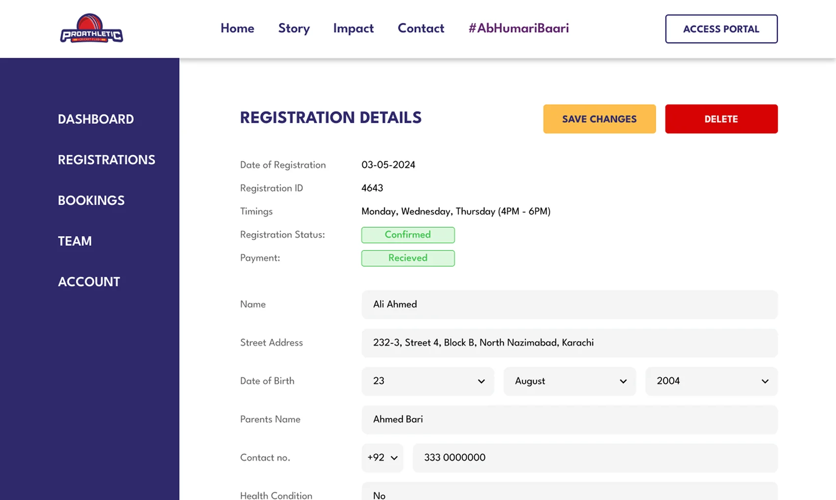
A full registration record — ID, confirmed status, payment received, player details — out of the Instagram inbox and into the site.
The academy runs from here.
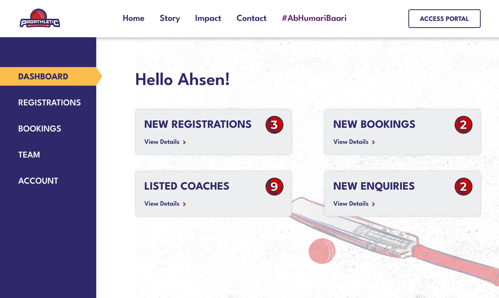
“Hello Ahsen” — new registrations and listed coaches at a glance, each with a live count so nothing hides.

- A smooth, structured registration flow — no DM required.
- Programs and schedules in one place, kept current.
- Announcements with a home instead of a disappearing story.
- A clear information hierarchy parents can actually navigate.
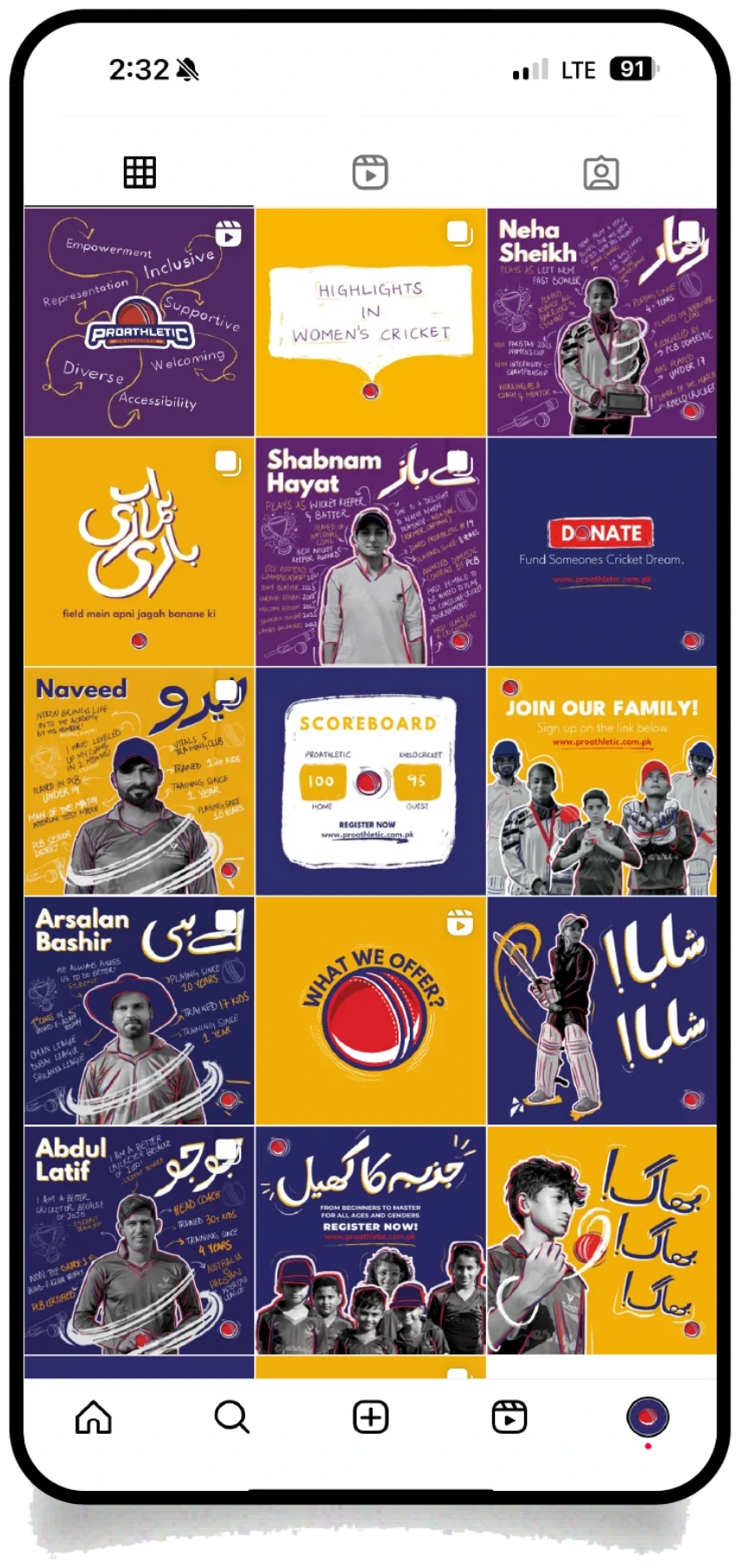


Match-day templates
Drop-in layouts for results and hype — same grid, same type, so the feed reads as one team and not one-off graphics.
Bilingual by design
Urdu carries the emotion, English carries the facts — the way the academy’s families actually speak, not a translation bolted on.
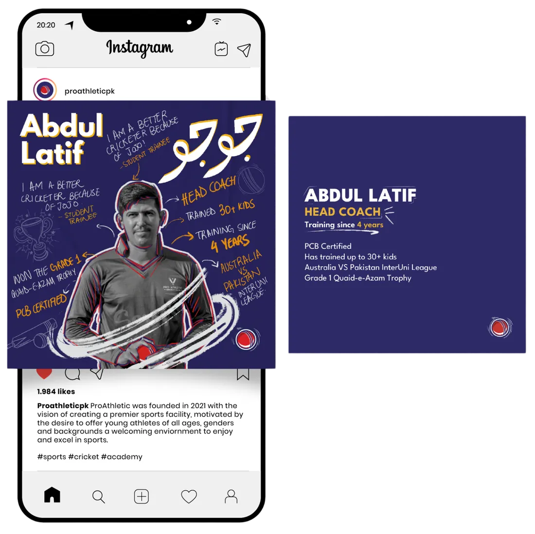
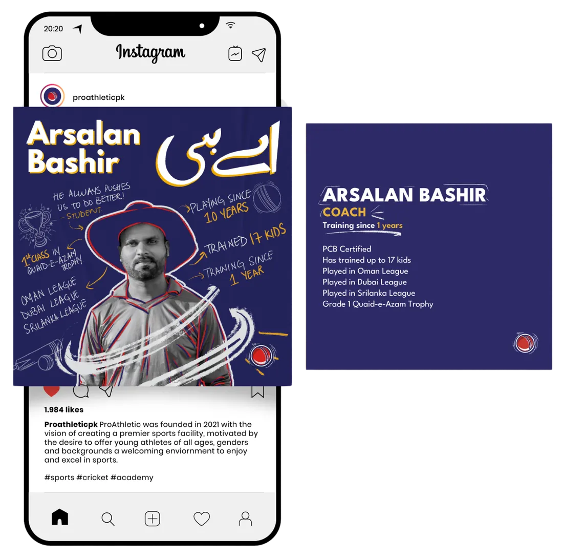
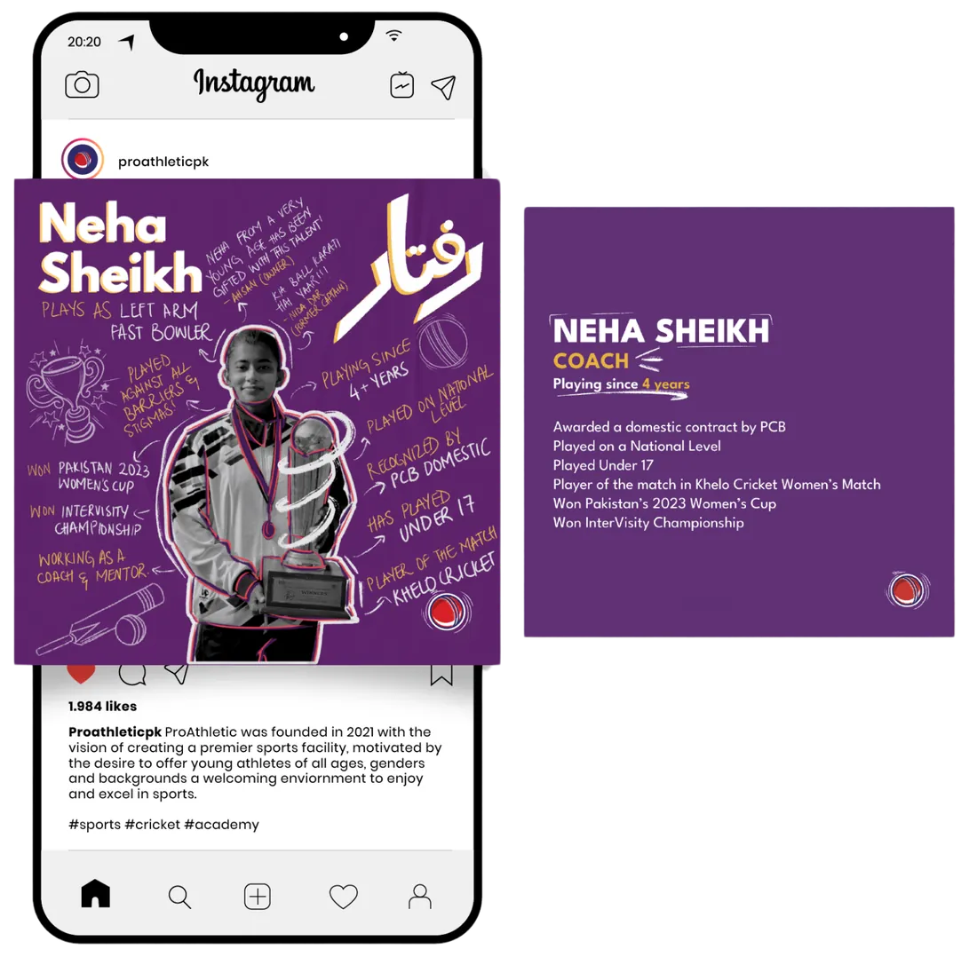
Coach intro cards
A repeatable card for every coach — credentials, record, and personality — turning the roster into proof the academy is the real thing.
One link, one CTA
Every template ends the same way — register at proathletic.com.pk — so the feed finally drives somewhere instead of dead-ending in the DMs.
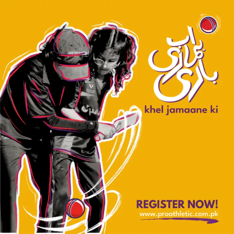
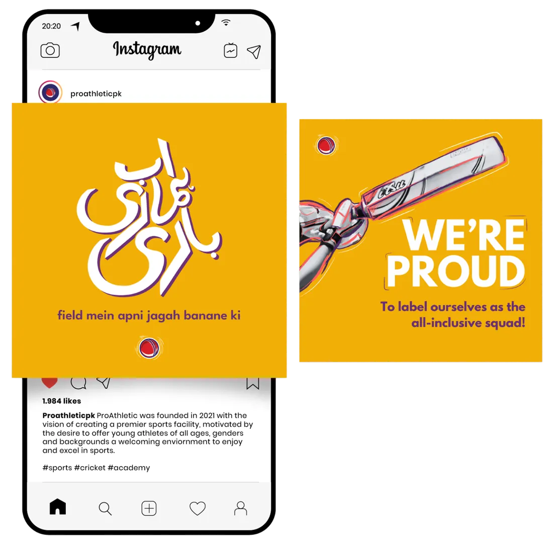
A campaign of its own: #AbHumaariBaari.
The women’s wing needed more than a slot in the feed — it needed its own rallying cry. #AbHumaariBaari — “now it’s our turn” — is a sub-campaign with its own purple-and-gold identity, built on real ProAthletic cricketers and grounded in where women’s cricket in Pakistan actually stands today.
Baari.
“Now it’s our turn.” One line a girl in the academy could say out loud — on a poster, a jersey, or a story.

Three things it had to do
Awareness alone changes nothing if there’s no money behind it — so the campaign was built to move from noticing, to believing, to funding.
Point attention at the talent already there in young female cricketers — and at the stage they’ve never had.
Give them the confidence to claim the field — real role models from the academy, not stock models.
Turn that goodwill into rupees — a clear ask for sponsors to back a named cricketer’s season.
What it set out to do
Two people it had to move
The campaign speaks to both ends of the problem at once — the girl who wants to play, and the sponsor who can pay for it.

“I want to play for Pakistan — but there’s nowhere near me that trains girls.”

“I’ll back something real — if I can see exactly where the money goes.”
Its own colours
A deliberate break from the academy’s navy and red — a bolder purple and gold that lets the campaign stand on its own while still belonging to ProAthletic.
The campaign in the wild
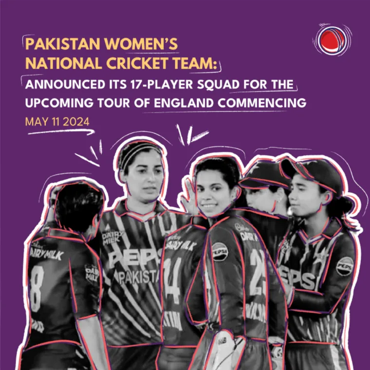
A run of Instagram posts carries the chant across the feed — player stories, women’s-cricket highlights, and a clear call to register or sponsor.


The system, on everything.
A brand is only as real as the things it ends up on. The four rules carried onto the kit and the membership card — the same identity tailored for a men’s team, a women’s team, a hijab-friendly cut, and coaches, so “for everybody” was something you could actually wear.
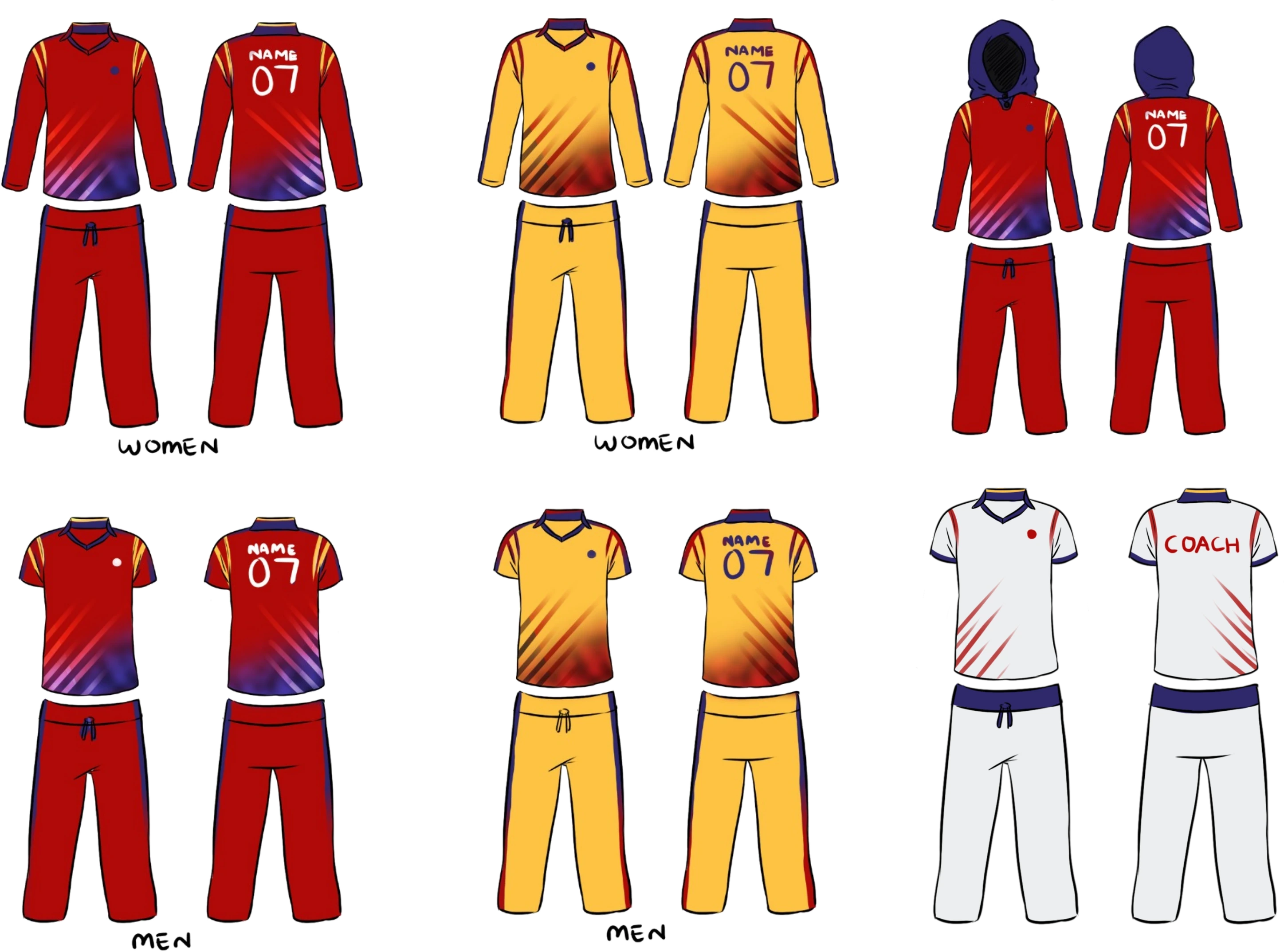
One system, a proper version for everyone who wears it.
The clearest test of an inclusive brand is whether everyone gets a real kit — not an afterthought. So the academy strip shipped tailored by who it’s for, with the women’s kit given two equal options in the Ab Humaari Baari purple-and-gold — a hijab cut and a half-sleeve cut, because not everyone who plays wears a hijab — alongside the men’s and coaching strips.

Full sleeves and a matching hijab cut from the same fabric — designed in from the start, not adapted later.

The same kit in a short-sleeve cut — equally part of the system, so the choice sits with the player, not the brand.
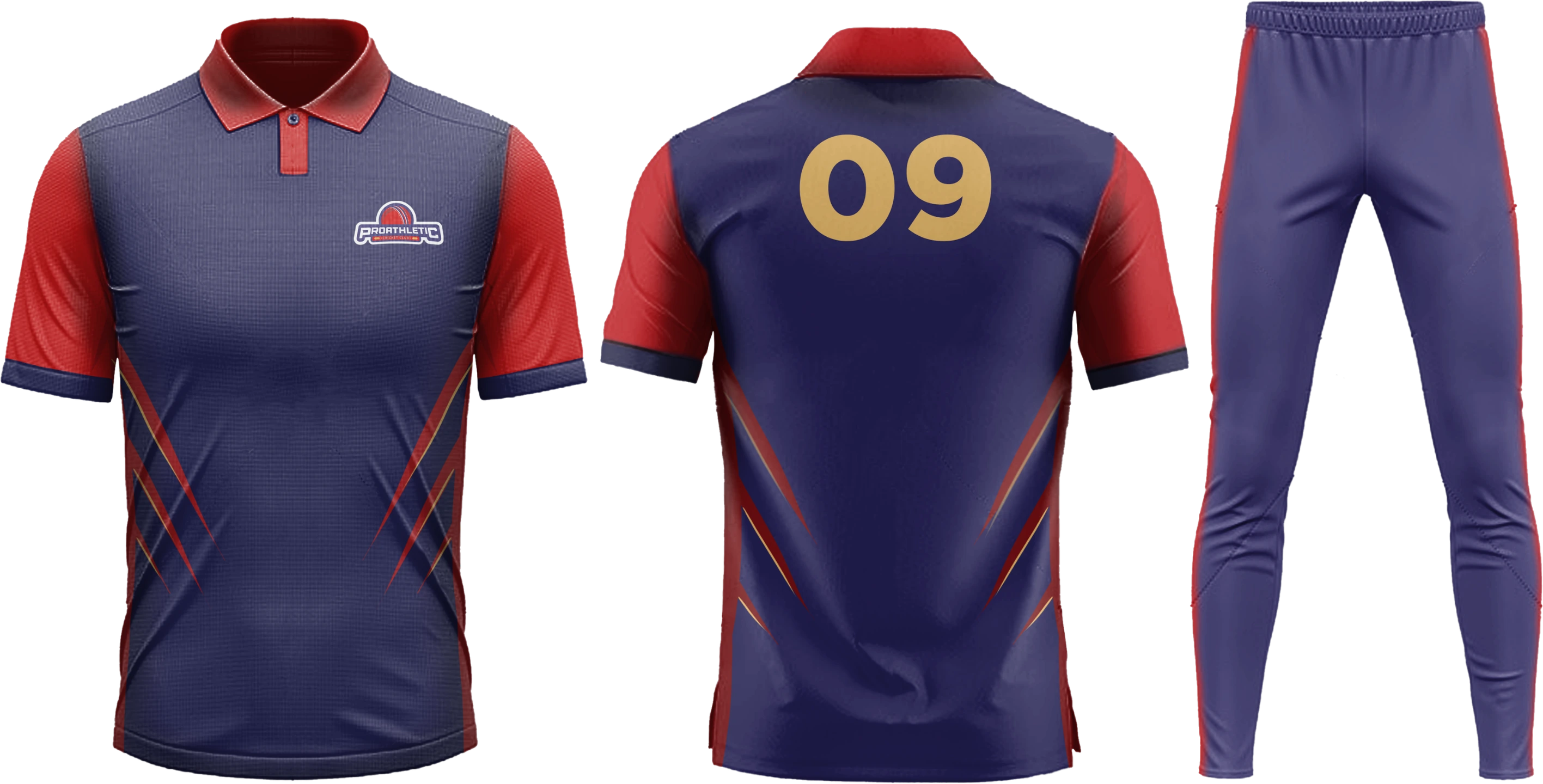
The match strip in academy navy and red — same emblem, same system, built for play.
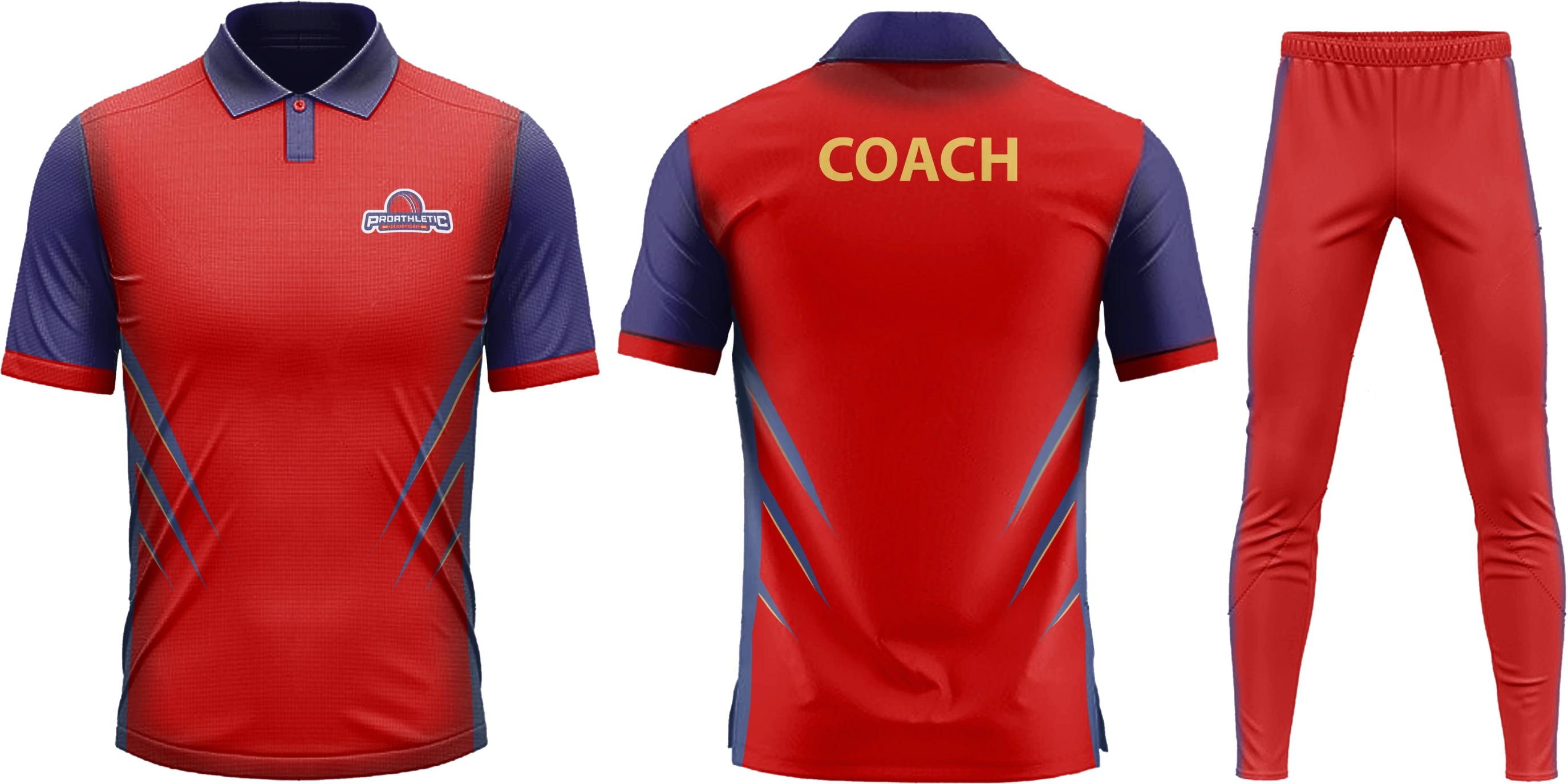
The colours flipped to red with COACH on the back, so staff read as one team on the ground too.
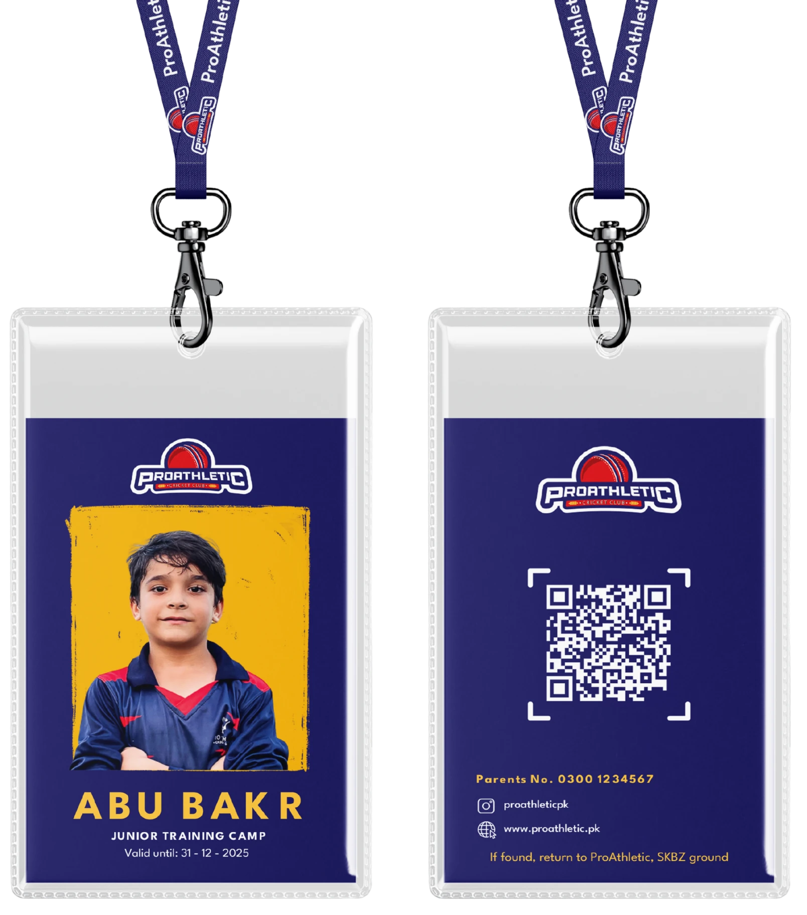
The first thing a new player holds.
A junior’s training-camp card on a branded lanyard — navy field, gold frame, emblem locked to the top. The back carries a QR to the player profile, a parent contact, and a return-to-ground line, so the card does a job as well as it looks the part. The same four rules that run the logo run this.
The academy finally looks like one.
ProAthletic shipped its first cohesive identity and a website to match — turning a scattered Instagram presence into something parents, players, and coaches all recognise.
cohesive digital identity for the academy — one emblem, one palette, one voice.
registration in place of Instagram DMs and in-person ground visits.
home for programs, schedules, and announcements — off the feed, finally findable.
One identity
A locked emblem and a tight palette the academy can’t drift from — across kit, cards, and social.
Registration, online
Parents sign up through the site instead of a DM thread — clearer for them, trackable for the academy.
A place to update
Schedules and announcements have a home, so engagement stopped depending on the algorithm.
Identity isn’t the logo. It’s looking the same twice.
The hardest part wasn’t drawing a badge — it was building a system disciplined enough that a coach posting from their phone and a registration page built months apart still read as the same academy. The emblem got the attention; the palette, the templates, and the registration flow did the quiet work of holding it together.

The feed where the brand actually lives.
Instagram was the academy’s whole front door, so the system had to win there first. Bilingual match-day templates — Urdu where the energy is (shabaash, bhaag), English where the details are — plus coach intro cards and one repeated call to action, so every post reads as ProAthletic and every post points to the same place: register.